Object-specific
properties
As explained above, objects also have properties
that are particular to the type of object. For example, fixtures have
unit numbers but do not have a radius. When an object is selected and
its properties are displayed, a tab appears in the properties dialog box
for that type of object. When you select multiple objects of different
types, tabs appear for each type of object selected.
The following objects are defined:
- points
- lines
- cones
- spheres
- text labels
- dimensions
- axes and motion frames
For all other types of objects (venues,
circles, arcs, risers, cylinders, and cameras), refer to Drawing
objects. In these cases, the properties dialog box offers the
same options that were given when the object was initially drawn.
Hanging structures properties (pipes, truss,
floor mounts, and so on) are fully defined in Hang structures.
Fixtures and lighting-specific object properties
are fully defined in the Fixture
properties
section.
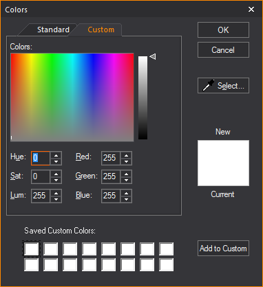
Colors window
The Colors window
allows for full customization and control over colors used in WYSIWYG.
From here the color of any object in WYSIWYG can be changed. This section
will explain the various features of the color window.
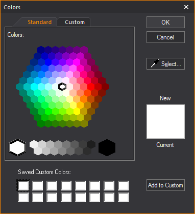
- Standard: A hexagon
of basic colors and shades available for selection.
- OK: Will confirm
the use of a new color to replace the current color.
- Cancel: Will exit
the color window without making a color selection.
- Select...: This
option is used to gather a custom color sample from anywhere on your
desktop. This option will turn the cursor into a dropper from which
colors can be gathered.
- New: Color selected
in the Color window.
- Current: The color
that is currently in use.
- Saved Custom Colors:
A saved palette of custom colors.
- Add to Custom:
Will save selected New color to the Saved Custom Colors palette.
- Custom: Section
for editing a selected color’s properties.
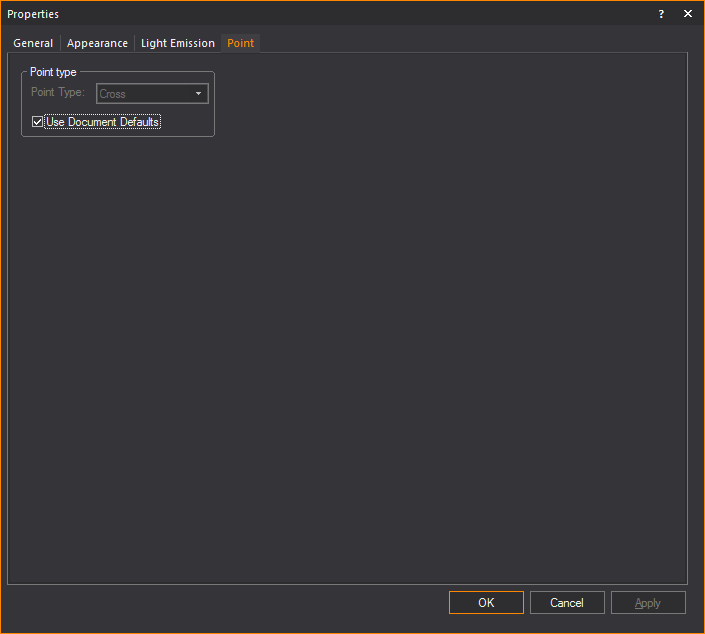
Point tab
Options on the Point tab
affect how the selected point is drawn. The default point type used in
a document is defined on the Object Settings tab
of Document Options. To ignore the default
setting, clear the Use Document Defaults checkbox,
and then select the desired point type.
Line
tab
Options on the Line tab
affect how the selected line is drawn.
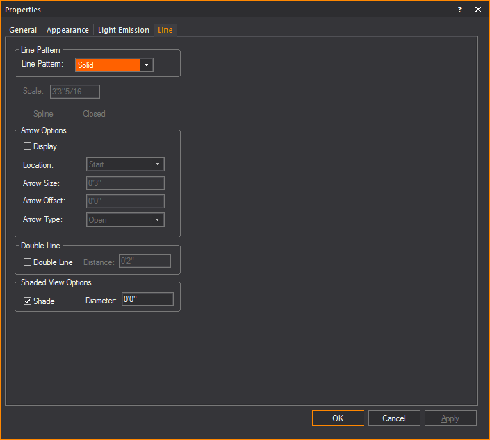
Line Pattern
- Line Pattern: Choose
a line pattern for the selected lines. For an illustration of each
line pattern, see Drawing
lines.
Note: Line
patterns are available for a Rectangle, Circle, Ellipse, and Arc or Elliptical
Arc, in the corresponding Properties windows.
Line patterns are available to a Closed Line Polygon
from the Line tab of its Properties
window.
- Scale: Type a value
in this box to change the length and spacing of dots and dashes for
the selected lines. This value is applicable to center, hidden, or
dot lines only.
- Spline: Select
the Spline checkbox to transform
a line into a spline or French curve.
- Closed: Select
the Closed checkbox to quickly
connect the first point of a multi-segment line to the last point
of that line.
Note: You
cannot change a line to a spline or French curve unless the selected line
has more than two vertices.
Arrow Options
How arrows attached to the line will be
shown.
- Display: Select
this checkbox to show an arrow at the end(s) of the line.
- Location: Where
the arrow will appear on the line.
- Arrow Size: How
large the arrow will appear.
- Arrow Offset: How
far away the arrow if from the line.
- Arrow Type: The
style of arrow that will be displayed.
Double Line
- Double Line: Select
this checkbox to display the line as a double line.
- Distance: How far
apart the double lines will be from each other.
Shaded View Options
- Select the Shade checkbox
to display the selected line(s) in Shaded views and renderings, and
in the Diameter box, type a value
for the radius to set its thickness.
Cone tab
Options on the Cone
tab affect how the object is drawn.
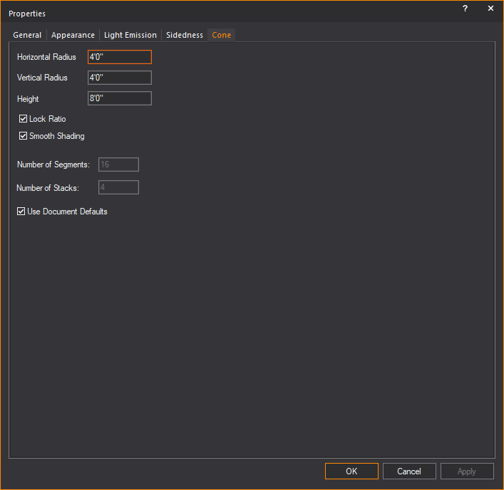
- Horizontal Radius:
Type a value to change the width of the base surface.
- Vertical Radius:
Type a value to change the depth of the base surface.
- Height: Type a
value to change the height of the cone.
- Lock Ratio: Select
this checkbox to lock the shape proportion when the size of the cone
is changed.
- Smooth Shading:
Select this checkbox to display a smooth appearance in Shaded view.
- Number of Segments:
Type a value to change the number of vertical divisions that appear
when the cone is broken into surfaces, set pieces, or lines.
- Number of Stacks:
Type a value to change the number of horizontal divisions that appear
when the cone is broken into surfaces, set pieces, or lines.
- Use Document Defaults:
Clear this checkbox if you want to specify the Number of Segments
and the Number of Stacks.
Sphere tab
Options on the Sphere
tab affect how the object is drawn.
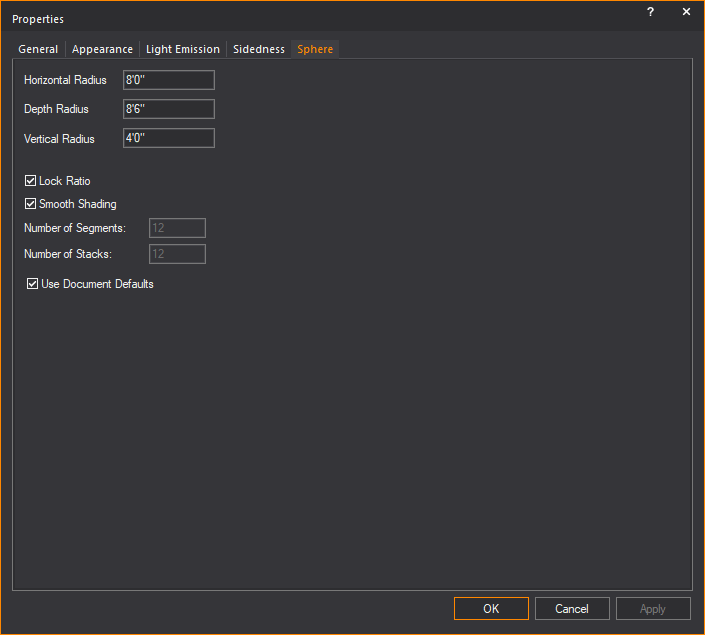
- Horizontal Radius:
Type a value to change the width of the middle of the sphere or equator.
- Depth Radius: Type
a value to change the horizontal depth of the middle of the sphere
or equator.
- Vertical Radius:
Type a value to change the vertical depth of the middle of the sphere
or equator.
- Lock Ratio: Select
this checkbox to lock the shape proportion when the size of the sphere
is changed.
- Smooth Shading:
Select this checkbox to display a smooth appearance in Shaded view.
- Number of Segments:
Type a value to change the number of vertical divisions that appear
when the sphere is broken into surfaces, set pieces, or lines.
- Number of Stacks:
Type a value to change the number of horizontal divisions that appear
when the sphere is broken into surfaces, set pieces, or lines.
- Use Document Defaults:
Clear this checkbox if you want to specify the Number of Segments
and the Number of Stacks.
Text
Label tab
Options on the Text
Label tab affect the information, justification and style
of the selected text labels.
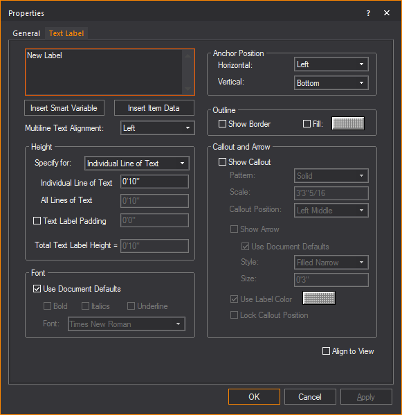
- Text Label: Type new text to change the label.
- Use SHIFT+ENTER
to type on the next line.
- Use ENTER to
close the dialog box (equivalent to the OK
button).
- Insert Smart Variable:
Open the Smart Variables window
and select a smart variable text from the table of smart variables
that are listed in the Production Team Info tab
in Document Options.
- Insert Item Data:
Open the Item Data window and
select data from the list of retrieved properties of selected fixtures
and trusses.
- Multiline Text Alignment:
How the text in the Text field will
be aligned.
Height
Section for controlling the height of the text label.
- Specify for: Choose
how you would like to specify the height of the Text Label.
- Individual Line of Text:
Sets the height for a single line of text.
- All Lines of Text:
Sets the total height of all lines of text.
Example: If you set
this to 4' and there are 4 lines of text, then each line of text will
be 1' in height.
- Text Label Padding:
Adds space between the text and the text label border.
- Total Text Label Height:
The height of the text and text label padding combined.
Font
Section for controlling the font settings
of the text label.
- Use Document Defaults:
Clear this checkbox to choose the default font and font styles for
all text labels, and then make your selections.
Anchor Position
Section for controlling how the text label
is anchored.
- Horizontal:
Select the Text label’s horizontal alignment from the drop-down list.
The available horizontal alignment options are:
Left: Places the selected
text label to the left of the insertion point.
Center: Horizontally
centers the selected text label on the insertion point.
Right: Places the
selected text label to the right of the insertion point.
- Vertical: Select the text label’s vertical
alignment from the drop-down list. The available vertical alignment
options are:
Top: Places
the selected text label below the insertion point.
Center:
Vertically centers the selected text label on the insertion point.
Bottom:
Places the selected text label above the insertion point.
Outline
- Show Border: Select
this checkbox to display a border around the text label.
- Fill: Select this
checkbox and click on the color box to add a fill color to the background
of the text label.
Callout and Arrow
Section for
controlling how callout lines and arrows attached to the line will be
shown.
- Show Callout:
Select this checkbox to display the text label with a callout line.
- Pattern: The pattern
of the callout line.
- Scale: The dimension
at which the callout pattern is to be viewed at making it legible.
- Callout Position:
The position on the text label where the callout will extend.
- Show Arrow: Select
this checkbox to show an arrow at the end of the callout.
- Style: The style
of the callout arrow that will be displayed.
- Size: How large
of the callout arrow that will appear.
- Use Label Color:
When selected will use the same color as the text label for the callout.
If not selected a different color can be chosen.
- Lock Callout Position:
When selected will lock the position of the callout when the text
label is moved.
- Align to View:
Select this checkbox to set the text labels to be legible regardless
of plot type.
Linear
Dimension tab
Options on the Linear Dimension tab affect the appearance
and measurement mode of the selected dimension. To change the length of
a dimension, it must be stretched in the drawing.
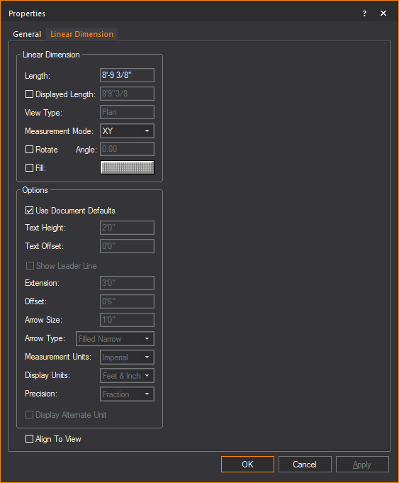
Linear Dimension
View and change how the linear dimension
is displayed.
- Length: This
box is not editable. It displays the actual length of the line drawn
for the dimension.
- Displayed Length: Select
this checkbox and type a value you wish to display.
- View Type: This
box is not editable. It displays the plot type in which the dimension
label is visible, which is determined when the dimension is drawn.
- Measurement Mode: Specify
the view in which the dimension will be visible. Measurement modes
are explained in Drawing
dimension objects.
- Rotate: Select
the checkbox to rotate the linear dimension.
- Angle: Type the
angle of rotation.
- Fill: Select
the checkbox and click the color select box to change the fill color
behind the dimension text.
Options
Customize the other elements of the linear
dimension.
- Use Document Defaults: Toggle
this option to specify whether the dimension is to use default document
settings as configured in the Dimension Styles tab, or use custom
settings.
- Text Height: The
height of the text used in the dimension.
- Text Offset: The
positive or negative offset of the text.
- Show Leader Line: Select
this checkbox to display the leader line which indicates the text
to the linear dimension.
- Extension: The
length of the extension lines.
- Offset: The
distance from extension line from the object being measured.
- Arrow Size: The
size of the arrow head used on the dimension.
- Arrow Type: The
style of arrow head used on the dimension.
- Measurement Units: Measurement
modes are explained in Drawing
dimension objects. Select Imperial or
Metric to change the measurement units.
- Display Units: The
preferred way to display measurements. For Imperial measurements,
choose between Feet & Inches, or just Inches; For Metric, the
options are Meters, Centimeters or Millimeters.
- Precision: Specify
the measurement precision of the dimension line. Based on your choice
for measurement units, you can choose to display the drawing resolution
in centimeters, millimeters, whole numbers, or fractions.
- Display Alternate Unit: Select
this checkbox to display the alternate unit.
- Align To View:
The orientation of the text used in the dimension. Select this checkbox
to set the horizontal alignment of the text to match your view.
Arc
Length Dimension tab
Options on the Arc
Length Dimension tab affect the appearance and measurement
mode of the selected arc length dimension. The arc length dimension can
only be changed when the arc itself changes.
Arc Length Dimension
- Arc Length: This
box is not editable. It displays the actual length of the arc to which
the dimension is attached.
- Displayed Length:
Select this checkbox and type a value you wish to display.
Options
- Use Document Defaults:
Toggle this option to specify whether the dimension is to use default
document settings as configured in the Dimension
Styles tab, or use custom settings.
- Text Height: The
height of the text used in the dimension.
- Text Offset: The
positive or negative offset of the text.
- Extension: The
length of the extension lines.
- Offset: The distance
from extension line from the object being measured.
- Arrow Size: The
size of the arrow head used on the dimension.
- Arrow Type: The
style of arrow head used on the dimension.
- Measurement Units:
Measurement modes are explained in Drawing
dimension objects. Select Imperial or
Metric to change the measurement units.
- Display Units:
The magnitude of scale which measurements will be shown, e.g. feet
or inches.
- Precision: Specify
the measurement precision of the dimension line. Based on your choice
for measurement units, you can choose to display the drawing resolution
in centimeters, millimeters, whole numbers, or fractions.
- Display Alternate Unit:
Select this checkbox to display the alternate unit.
Radial Dimension tab
Options on the Radial
Dimension tab affect the appearance and measurement mode of
the selected radial dimension. The radial dimension can only be changed
when the circle or arc itself changes.
Radial Dimension
- Radius: This box
is not editable; it displays the actual radius of the circle or arc
to which the dimension is attached.
- Displayed Length:
Select this checkbox and type a value you wish to display.
Options
- Use Document Defaults:
Toggle this option to specify whether the dimension is to use default
document settings as configured in the Dimension
Styles tab, or use custom settings.
- Text Height: The
height of the text used in the dimension.
- Extension: The
length of the extension lines.
- Offset: The distance
from extension line from the object being measured.
- Arrow Size: The
size of the arrow head used on the dimension.
- Arrow Type: The
style of arrow head used on the dimension.
- Measurement Units:
Measurement modes are explained in Drawing
dimension objects. Select Imperial or
Metric to change the measurement units.
- Display Units:
The magnitude of scale which measurements will be shown, e.g. feet
or inches.
- Precision: Specify
the measurement precision of the dimension line. Based on your choice
for measurement units, you can choose to display the drawing resolution
in centimeters, millimeters, whole numbers, or fractions.
- Display Alternate Unit:
Select this checkbox to display the alternate unit.
Angle Dimension tab
Options on the Angle
Dimension tab affect the appearance and measurement mode of the
selected protractor object.
Angle Dimension
Displays the actual measurements of the
Angle Dimension.
- Angle: This box
is not editable; it displays the angle as measured by the Angle Dimension.
- View: The box is
not editable; it displays the view that the angle was drawn in. Angles
are only visible as long as they are drawn in a views coplanar to
either XY, XZ, or YZ planes.
- Flip Angle: Toggle
this option to switch between measuring the interior and exterior
angle defined by the Angle Dimension.
Options
Specify display settings of the Angle Dimension.
- Text Height: Type
a value to change the height of the text displayed by the angle dimension
tool.
- Extension Lines:
Type a value to change the length of the extension lines.
- Radius: Type a
value to change the radius of the angle dimension arc.
- Fixed Text Distance:
Toggle this option to specify a fixed distance from the text to the
middle of the arc.
- Show Leader Line:
Clear the Fixed Text Distance checkbox
and toggle this option to display the anchored center line.
- Close Extension Lines:
Toggle this option to close the center extension or to specify the
length of the center extension.
- Show Arrows: Toggle
this option to display the arc with arrows. You can specify the size
of the arrow and choose the arrow type from the drop-down list.
Axis tab
Options on the Axis tab
affect the appearance of the selected axis. The Axis tab
also enables you to specify the patch settings for the selected axis.
Tip:
You can select an axis from the Wireframe views in DESIGN and LIVE modes
and open its Properties window.
- Name: Modify this
property to change the name of the axis.
- Type: Indicates
the type of axis. Can be one of Linear or Rotation.
Patch
- Patch Type: Allows
you to specify which patch type you want. Can be one of DMX or Motion
Patch. If DMX Patch is selected
then the DMX Patch area will be enabled while the Motion Patch is
disabled.
- DMX Patch - Universe:
Select the DMX Universe to which you want to bind the axis. The Universe
must be created in DATA mode.
- DMX Patch - Address:
Specify the starting address of the axis object. Linear and Rotational
axes take up two channels in a DMX universe (Move, Move Fine).
- Motion Patch – Universe:
Select the Motion Control Universe to which you want to bind the axis.
The Universe must be created in DATA mode.
- Motion Patch - ID:
Specify the root ID of the axis. Linear and Rotational axes will take
up one slot in the Motion Control Universe.
Arrow Size
- Size: Type a value
to change the size of the arrow on a selected linear axis.
Label
- Height: Type the
height of the text associated with the axis.
- Align to View:
Select this checkbox to align the axis to the specific view that it
is in (i.e. Side, Front, Back, Iso).
- Show Label: Select
this checkbox to display the label text of the axis.
- Label Position:
Choose where to place the label text along the axis.
- Text Justification- Horizontal:
Choose how the label text is aligned horizontally to the axis.
- Text Justification - Vertical:
Choose how the label text is aligned vertically to the axis.
- Font: Clear the
Use Document Defaults checkbox
to change the font face of the label text, or leave the Use
Document Defaults checkbox selected to use defaults.
Frame tab
Options on the Frame tab
affect the appearance of the selected frame. The Frame tab
also enables you to specify the patch settings for the selected frame.
Tip:
You can select a Frame from the Wireframe views in DESIGN and LIVE modes and
open its Properties window.
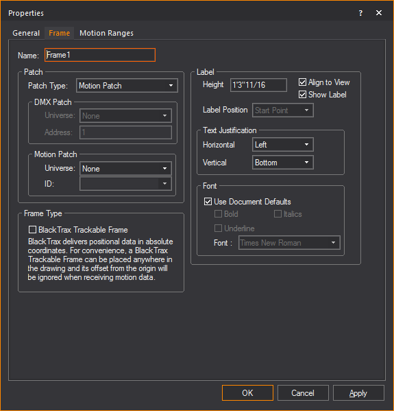
- Name: Modify this
property to change the name of the frame.
Patch
- Patch Type: Allows
you to specify which patch type you want. Can be one of DMX or Motion
Patch. If DMX Patch is selected
then the DMX Patch area will be enabled while the Motion Patch is
disabled.
- DMX Patch - Universe:
Select the DMX Universe to which you want to bind the frame. The Universe
must be created in DATA mode.
- DMX Patch - Address:
Specify the starting address of the frame object. Frames take 12 channels
(X, X Fine, Y, Y Fine, Z, Z Fine, Rx, Rx Fine, Ry, Ry Fine, Rz, and
Rz Fine).
- Motion Patch – Universe:
Select the Motion Control Universe to which you want to bind the frame.
The Universe must be created in DATA mode.
- Motion Patch - ID:
Specify the root ID of the frame. Frames will take up 6 slots in the
Motion Control Universe, where each slot will take the form of ID:X,
ID:Y, ID:Z, ID:Rx, ID:Ry, and ID:Rz.
Frame Type
- BlackTrax Trackable Frame:
Select this checkbox to set the frame for BlackTrax and associate
with a BlackTrax Trackable.
Label
- Height: Type the
height of the text associated with the frame.
- Align to View:
Select this checkbox to align the frame to the specific view that
it is in (i.e. Side, Front, Back, Iso).
- Show Label: Select
this checkbox to display the label text of the frame.
- Label Position:
Choose where to place the label text along the frame.
- Text Justification- Horizontal:
Choose how the label text is aligned horizontally to the frame.
- Text Justification - Vertical:
Choose how the label text is aligned vertically to the frame.
- Font: Clear the
Use Document Defaults checkbox
to change the font face of the label text, or leave the Use
Document Defaults checkbox selected to use defaults.
Motion Ranges
tab
Options in the Motion
Ranges tab enable you to modify the allowed ranges of motion
for the selected Frame.
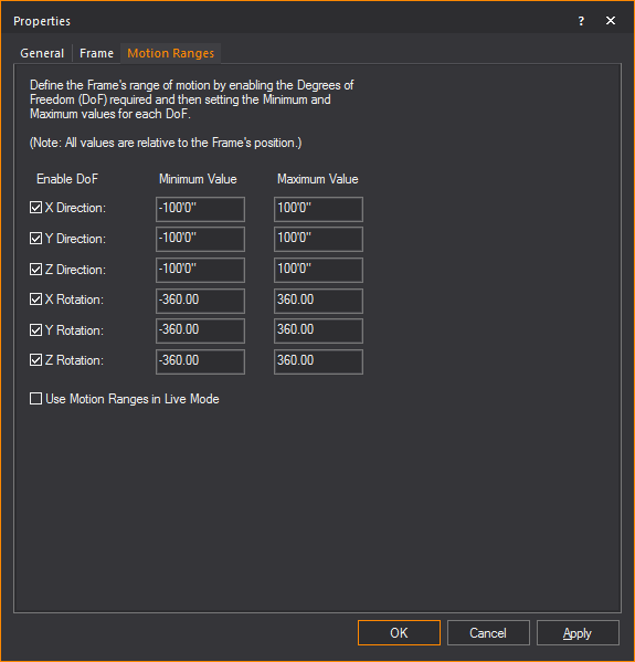
- X Direction: Select
this checkbox to allow linear movement along the X axis. Edit the
minimum and maximum extents to define the Frame’s motion range.
- Y Direction: Select
this checkbox to allow linear movement along the Y axis. Edit the
minimum and maximum extents to define the Frame’s motion range.
- Z Direction: Select
this checkbox to allow linear movement along the Z axis. Edit the
minimum and maximum extents to define the Frame’s motion range.
- X Rotation: Select
this checkbox to allow rotations around the X axis. Edit the minimum
and maximum extents to define the Frame’s motion range.
- Y Rotation: Select
this checkbox to allow rotations around the Y axis. Edit the minimum
and maximum extents to define the Frame’s motion range.
- Z Rotation: Select
this checkbox to allow rotations around the Z axis. Edit the minimum
and maximum extents to define the Frame’s motion range.
- Use Motion Ranges in Live
Mode: When disabled, the specified motion ranges will only
be enforced in DESIGN mode, giving you the full free range of motion
in LIVE mode. When enabled, the specified ranges of motion will be
enforced in LIVE mode as well.
 © CAST Group of Companies Inc., 2002-2022
All rights reserved.
© CAST Group of Companies Inc., 2002-2022
All rights reserved.