Editing objects
CAD mode is where you edit your show drawings.
This includes editing your venue, set pieces, lighting positions, focus
positions, and lighting fixtures. Editing in CAD mode is similar to many
other CAD programs, so many of the concepts will be familiar to those
who have used a computer-aided drafting program before. WYSIWYG adds features
that are specific to the entertainment industry, such as a comprehensive
3D library containing truss, lighting equipment, lighting accessories,
props, musical instruments, and various human figures.
In this section
Editing
objects in CAD mode
Layers
Scenes
CAD
tools
Editing objects in CAD mode
Selecting
Before you can manipulate objects, you
must select them. Selected objects are easily identifiable: a white box
appears at the insertion point and the lines of the object become dotted.
Fixtures that are selected are filled in green and their beams can be
set to either on or off.
Use the following table to identify the
selection method for objects.
Desired
action |
Selection
method |
Select a single object. |
|
Select a single fixture. |
In Wireframe view, click on or inside
the fixture symbol’s outline. In Isometric view, click the symbol’s
outline to select the fixture. |
Select multiple objects. |
Press and hold CTRL while
clicking on the desired objects. Draw a box from left to right to select
all objects fully within the box. Draw a box from right to left to select
all objects fully within the box, as well as the objects partially
contained in the box. |
Select all the objects on the current
layer. |
|
Select all the objects on the screen. |
|
Select previous selected object. |
|
Select last object created. |
|
Select all the objects on one or
more layers or in layer groups. |
From the menu,
choose and then
click .
You can also use the Specify Layers
tool on the Selection toolbar.
 To select multiple layers, press and
hold CTRL while selecting
the layers. To select multiple layer groups, press
CTRL while selecting the
layer group cell. |
Invert Selection |
From the menu,
choose and then
click . You can
also use the Select all editable objects
that are not currently selected tool on the Selection toolbar.  Press CTRL+I
to deselect all editable objects currently selected,
and consequently select all the other editable objects that
were previously not selected. See Invert selection. Press CTRL+SHIFT+I to
select and deselect only fixtures in CAD, DESIGN and LIVE
mode. See Invert
fixture selection. |
Select native objects. |
In Wireframe view, right-click and choose
Select Native Objects. Choose the desired native object from
the list of created native objects. |
Selection sets |
In CAD, DATA, DESIGN, and LIVE Modes,
click on the Selection Sets shortcut on the Selection
Sets shortcut bar to select objects by their selection
sets. |
Set beam display for selected fixtures. |
|
Select all instances of a particular
library item. |
In Wireframe view, right-click and choose
, and then
either select the library item from the menu that appears,
or click to select
the item from a selection box. |
Select all library items. |
|
Select all instances of a particular
fixture. |
In Wireframe view, right-click and choose
, and then either
select the fixture from the menu that appears, or click to select the fixture
from a selection box. To save time, you can also press SHIFT+S. |
Select all fixtures. |
|
Select all fixtures on a particular
type of pipe or truss. |
In Wireframe view, select the type of
pipe/truss containing the fixture that you want to select.
Right-click and choose and then click
the type of fixture from the list, or click to select all fixtures on this type of pipe
or truss. |
Select fixtures by their fixture
group. |
In CAD Mode (Wireframe, Quad, Shaded
view), DATA Mode (H Select and V Select), DESIGN Mode (Wireframe,
Quad, and Shaded view), and LIVE Mode (Wireframe, Quad, and
Shaded view), click on the fixture group shortcut on the Fixture
Group shortcut bar to select fixtures by their fixture group. |
Select
fixtures by their lighting position. |
In CAD Mode (Wireframe, Quad, Shaded
view), DATA Mode (H Select and V Select), DESIGN Mode (Wireframe,
Quad, and Shaded view), and LIVE Mode (Wireframe, Quad, and
Shaded view), you can right-click to select fixtures by their
lighting position. Note, however, that you have to name all
of your lighting positions before you can use this feature.
If you do not have any lighting positions named, then you
cannot use this tool because the position names will not populate
in the list. |
To select various fixtures in your file,
right-click in a wireframe, click Select All,
and then select the fixture type. This functionality is available in CAD,
DESIGN, and LIVE modes.
Cycle selection
This feature is helpful when you need to
select an object that shares an edge with another object. For example,
if you need to select the roof of a building that shares its edges with
the building’s walls. Left-to-right drag-selection in a side or elevation
view works, of course, but there are many cases when this method cannot
be used.
To use cycle selection
- To activate Cycle Selection, simply press SHIFT before clicking to select.
When Cycle Selection is active, Cycle On appears
in the WYSIWYG Status bar.
- To select the object, click in a spot where two
or more lines overlap or intersect (“lines” do not necessarily mean
Line objects, but rather lines that are part of anything drawn or
inserted from the library).
- To continue selecting, keep pressing SHIFT to
continue cycling through all the items that share the coordinate where
you have clicked (in the order in which they were added to the drawing).
Tips:
- If you also press CTRL at
the same time as SHIFT, you can
add items to an existing selection set when those items can only be
selected by Cycle Selection.
- Hold down CTRL+SHIFT and click at a coordinate
where something in the same “cycle set” was already selected to cycle
through all items again, including the one already selected.
- Ensure that when cycling through the cycle set,
you do not make a mistake by canceling the selection of an item that
you need to have selected (although in order to do so, you would have
to release CTRL+SHIFT when
you cycle to this item instead of holding CTRL+SHIFT down as you “pass over it”).
Invert
selection
This feature is helpful if you want to
cancel the selection of all the currently selected editable objects (in
CAD), and consequently select all objects that were previously not selected.
- From the menu,
choose > to activate invert selection,
or press the INV button on the
Selection toolbar, or press CTRL+I, which applies to all objects
displayed in CAD Wireframe and Shaded views.
- Pressing CTRL+SHIFT+I activates
invert selection of fixtures and applies only to all the fixtures
displayed in CAD Wireframe and Shaded views.
Note: Invert
selection is also available in DESIGN and LIVE mode. See Using
the design tools.
To use invert selection
For example, if your drawing has a total
of 10 objects, and 4 objects out of the 10 are currently selected. Press
CTRL+I to activate invert selection.
Result: The
4 selected objects will be deselected and the other 6 objects that were
previously not selected, will be selected automatically.
Note: Press
CTRL+SHIFT+I to select and deselect
only fixtures in CAD.
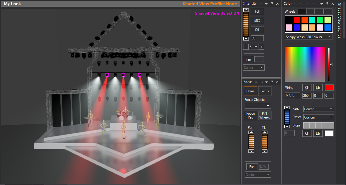
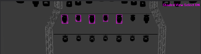
Shaded view selection
You can select fixtures in Shaded view
in CAD, DESIGN, and LIVE modes. This allows you to click on a fixture
in the Shaded view, which will then activate the fixture for editing with
the Designer tools. You can select multiple fixtures at one time by either
drag-selecting or holding down CTRL
while selecting fixtures.

Using shaded view selection
You can activate Shaded View Selection
by pressing TAB while in CAD,
DESIGN, or LIVE mode > Shaded View. Once you press TAB,
you will notice a message in magenta on the top right-hand corner of the
Shaded view window: “Shaded View Select ON”.
To activate shaded view selection
- In a Shaded view in CAD, LIVE or DESIGN mode (meaning
the amber outline appears around the Shaded view), press TAB once.
You are now in Shaded View Selection mode.
- To select a fixture in Shaded View Selection mode,
click directly on a fixture’s image in the Shaded view:
- To select multiple fixtures in Shaded View Selection,
press CTRL and click each
fixture that you want to select. You can also select multiple fixtures
at once by drag-selecting with the mouse as you would in wireframe
modes; Shaded View Selection disables the camera movement controls
so you can drag a marquee box around fixtures to select them.
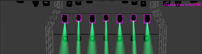
- Once you are finished selecting fixtures, press
TAB again to exit from Shaded
View Selection mode. You will then regain control of the Shaded view
camera.
Tips:
- It is helpful to keep your hand near the TAB key while selecting fixtures
and maneuvering around with the camera; once you need to move around
your view, press TAB to exit
Shaded View Selection. Your fixture selection is maintained as you
move in and out of the Shaded View Selection mode.
- Make sure while you navigate around in the Shaded
View that you give yourself a good angle on the view in which you
want to select fixtures. It may be difficult to select a fixture in
the middle of a lighting position or truss while you’re looking at
a side view of it.
To focus a fixture using shaded view selection
Shaded View Selection enables you to focus
your fixture by clicking on the target in Shaded views.
- Activate Shaded View Selection by pressing TAB while in DESIGN or LIVE mode
> Shaded view.
Result: A
message in magenta appears on the top right-hand corner of the Shaded
view window: “Shaded View Select ON”.
- Click to select the fixture that you want to focus.
To select multiple fixtures, press CTRL and
click to select them. Alternately, fixtures can be selected using
the Fixture Selection toolbar.
- Activate the focus feature by pressing F
on your keyboard (or right-clicking and selecting from
the menu). Alternately, you can press L to
activate the “Full and Focus” feature (or right-click and select from the menu). The Status
bar will indicate when a focus operation is active.
- Click in the Shaded view to select the focus target.
- Press TAB
to exit Shaded View Selection.
Using
the fixture selection toolbar
The Fixture Selection toolbar offers three
convenient methods to select fixtures in your file and a method to traverse
your selection.
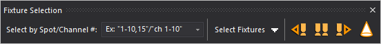
Fixture Selection by Spot number
The toolbar has a combo box in which you
can type in Fixture spot numbers that you would like to select (as you
would on most lighting consoles). For a consecutive range of fixtures,
use a dash ( - ), or to enter a list use commas (,)
Note: This
method will only work if fixtures have already been assigned Spot numbers.
Example: “1-10,
15, 20” will select 12 fixtures, with Spot numbers: 1,2,3,4,5,6,7,8,9,10,15,20.
The combo box will remember previous selection
strings and display them when you click on the down arrow.
Fixture Selection by Channel value
In the combo box, you can type the channel
value, using “ch” to identify the channel. Use a dash for a consecutive
range.
Note: This
method will only work if fixtures have already been patched with Channel
numbers.
Example: “ch1-10”
will select all the fixture patched to channel numbers 1 to 10.
Select Fixtures By
The Fixture Selection toolbar
offers a drop-down menu of all the “Select Fixture By” methods listed
in the menus.
Use the Next button
to traverse the fixtures selected one by one from first to last, or use
the Previous button to traverse the
fixtures selected one by one in the reverse order. Select the All button
to select all fixtures in your current selection.
Highlight fixtures
The Highlight feature is available on the
Fixture Selection toolbar in DESIGN
mode only. In Shaded view, Highlight sets the currently selected fixture(s)
to an open beam at 100% full intensity temporarily, without changes to
the fixture’s saved settings. See Highlight
fixtures
in Design tools.
Undo/redo
If you discover that you have made an error
while editing an object, you can easily reverse the error by using the
Undo tool available in WYSIWYG. The name of the Undo tool changes based
on what the last action was (for example, if the last action was a Paste
operation, the Undo tool will be Undo Paste). You can use Undo to reverse
the last series of actions until the tool is greyed out.
If you decide that you did not want to
undo an action, use the Redo tool. Similar to the Undo tool, the name
of the Redo tool changes based on what the last undo action was.
To use the undo tool
From the menu,
choose .
Tip: You may
also use the Undo tool on the Edit toolbar.
 The Undo
button.
The Undo
button.
Result: The
last action you performed is reversed.
To use the redo tool
From the menu,
choose .
Tip: You may
also use the Redo tool on the Edit toolbar.
 The Redo
button.
The Redo
button.
Result: The
last undo action you performed is reversed.
Grouping/ungrouping
Grouping objects together ensures that
they will always be selected as one. For example, you may want to group
an object and its corresponding focus position. If you relocate the object
in the drawing, the focus position will automatically follow, as will
all the light beams pointing at it, saving you time and work.
In order to use Groups effectively, it
is important to understand how they operate in WYSIWYG (which may be different
than in other software). To that end, ensure that you have read through
the Groups
in WYSIWYG section.
To group objects
- Select the objects to be grouped.
- From the menu,
choose .
Tip: You may
also use the Group tool on the Tools toolbar.
 The Group button.
Result: The Dynamic Group Outline appears to
indicate that the selected objects have been Grouped.
Dynamic Group Outline is
a dashed framing outline enclosing all the objects within a Group. The
color of the outline is the same as the color of the Layer where the Group
belongs. Dynamic Group Outline will continue to appear every time a Group
is selected, until the Group is Ungrouped. For more information, see Dynamic
group outline section.
To ungroup objects
- Select the grouped objects.
- From the menu,
choose .
Tip: You may
also use the Ungroup tool on the Tools toolbar.
 The Ungroup button.
Result: The
objects are ungrouped and the Dynamic Group Outline disappears.
Note: You
can group together objects located on different layers, but the resulting
group can only exist on one layer.
To change or view the layer
of a group
- Select the object(s) for which you want to view
the grouping.
- Right-click and select .
Tip: At any
time, to access an object’s properties, you can click the Properties tool
on the Edit toolbar.
 The Properties
button.
The Properties
button.
- Click the Group tab.
Result: The
layers for the objects in the group are listed with the layer for the
group highlighted.
Note: By default,
the group assumes the current layer when initially created.
- To group the objects on a different layer, select
the layer from the list.
- Click OK.
Selection
sets
You can group non-fixture objects and create
Selection Sets shortcuts in the Selection Sets shortcut
bar in CAD, DATA, DESIGN, and LIVE modes. Selection Sets apply to any
and all drawn objects and objects inserted from the Library
Browser, which include Groups, Truss and Assembled truss.
Multiple Selection Sets can be created on an object.
Selection Sets are NOT the
same as Groups because they only save which particular objects are selected,
and the order in which they are selected.
To create a selection set
- Select the objects you want to group and select
with a shortcut.
- On the shortcut bar, click Selection
Sets.
- Right-click on the open space on the Selection
Sets shortcut bar, and choose New Selection
Set from the pop-up menu.
Result: The
Enter new selection set name dialog box
appears.
- Type a name for the new selection set.
- Click OK.
Result: The
new Selection Set shortcut appears on the Selection
Sets shortcut bar.
Moving
WYSIWYG supports two types of move commands:
relative and absolute.
Absolute coordinates are relative to the
origin of the drawing. An absolute move is defined as moving an object
from one specific point to another.
A relative move
is defined as moving an object to a destination relative to its original
position.
To move an object using the mouse
- Select the objects to be moved.
- Hover over the object until a grey box appears,
and then click and hold.
- Drag the object to the new position, and then
release the mouse button to finish the move.
To move an object using absolute values
- Select the objects to be moved.
- From the menu,
choose .
Tip: You may
also use the Move tool on the Tools toolbar.
 The Move button.
- Press ENTER on
your keyboard to move the object from its insertion point, OR click
to set the base point for the move, OR type the coordinates of the
base point, and then press ENTER.
Note: When
you start typing, a box appears at the bottom left-hand corner of the
window, showing the value that you enter.
- Type the new coordinate location for the base
point, and then press ENTER.
Tip: You can
change only one or two coordinates to an absolute location while keeping
the other coordinates as they are.
Example: If
you wish for an object to move to a height of Z=10, but you don’t know
the X and Y coordinates. Start the Move command
and type “x, y, 10” in the Command Line after
picking the base point.
To move an object using relative values
- Select the objects to be moved.
- From the menu,
choose .
Tip: You may
also use the Move tool on the Tools toolbar.
 The Move button.
- Type @,
followed by the distances to move the object, and then press ENTER. For example, to move an object
2’-0” stage right (X axis) and 3’-0” off the floor (Z axis), type
the following, and then press ENTER:
@2’,0,3’
To move an object using distance and direction
- Select the objects to be moved.
- From the menu,
choose .
Tip: You may
also use the Move tool on the Tools toolbar.
 The Move button.
- Type @,
the distance that you want to move the object, the < sign, and
the direction (as an angle, positive or negative) to move the object,
and then press ENTER. For example,
to move an object 3’-6” to the left, type the following, and then
press ENTER:
@3’6”<-180
Nudging
To save time and for added precision when
working in your model, you can use the Nudge feature to nudge any object
except fixtures. The amount of the nudge is equal to the size of the Grid.
For information on changing the grid size, refer to Draw
Defaults tab.
To nudge an object
- In your model, click to select the object that
you want to move.
- Press and hold the SHIFT and
ALT keys on your keyboard
simultaneously, and then press the ARROW keys
on your keyboard to nudge the object in the desired direction.
Tip: To nudge
objects in increments ten times larger than the size of the grid, do not
hold down SHIFT.
Note: You
can use the Position Tool to nudge
selected object(s) by specifying new coordinate numbers for the X, Y, and
Z axes. For more information, see
Position
Tool.
Sending
to back/bringing to front
The feature is very useful for correcting
draw order issues (among other things). WYSIWYG displays objects “on top
of each other” in the order in which they were added to the drawing. For
example, if you draw/insert a table after you draw/insert a piece of truss
above it (i.e., at a different missing coordinate), the table will appear
“above” the truss (in Plan View), even though the table is on the floor
and the truss is up in the air.
You can use the Send
to Back or Bring to Front commands
to arrange the way the objects appear in your drawing. Note, however,
that when you do so the physical location of the objects is unchanged;
you are only changing the way in which they are displayed.
To send an object to the back / bring an object to the front
Notes:
- The Send to Back option
will “place” the selected object “below” everything else in the drawing.
- The Bring to Front option
will “place” the selected object “above” everything else in the drawing.
- You may note that sometimes the object will not
move from its current position. This may be due to the Draw
Order settings on the Draw Defaults
tab of Document Options and
View Options. These settings supersede
any Send/Bring commands by essentially telling WYSIWYG to always draw
fixtures, objects, and hang structures in the order shown.
- In CAD mode, select the object that you want to
send to back or bring to front.
- Right-click and select or .
Tip: Alternately,
you can use hotkeys to send items to the back/bring them to the front:
- open curly bracket for Bring to Front (i.e.,
{ or SHIFT+[
)
- closed curly bracket for Send to Back (i.e.,
} or SHIFT+] )
Rotating objects
You can rotate objects around a base point
to place them on angles in your drawing.
To rotate an object
- Select the object(s) to be rotated.
- From the menu,
choose .
Note: You
may also use the Rotate tool on the Tools
toolbar.
- Press ENTER on
your keyboard to rotate the object from its insertion point.
OR
- Click to set the center point for the rotation.
OR
- Type in the coordinates of the center point for
the rotation, and then press ENTER.
- Type the rotation angle, and then press ENTER, or drag the mouse and click to
type the rotation angle. For example, to rotate an object 45 degrees,
type 45, and then press ENTER.
Rotating objects in place
You can rotate multiple objects around
their respective insertion points to place them all at the same angle
in your drawing.
To rotate multiple objects in place
- Select the objects to be rotated.
- From the menu,
choose .
- Click to set the base point used for the rotation
angle.
OR
- Type in the coordinates of the base point, and
then press ENTER.
Note: The
base point is only used to help determine the angle, as each object is
rotated around its own insertion point.
- Type the rotation angle, and then press ENTER, or move the mouse and click to
set the rotation angle. For example, to rotate objects 45 degrees,
type 45, and then press ENTER.
Resetting object orientation
Resetting the orientation of an object
keeps the object at its insertion point. The object rotates around the
insertion point to its original orientation.
To reset the rotation of objects
- Select the objects whose rotation needs to be
reset.
- From the menu,
choose .
Result: The
object’s orientation resets to its default orientation.
Mirroring
The Mirror command duplicates and reverses
an object, inserting it the same distance from an axis line as the original
object.
Notes:
- After mirroring an object that was originally
created through a merge operation, you cannot reliably perform another
merge procedure on this object; therefore, it is recommended that
you perform all merge operations on these objects before
you mirror them.
- Pipes and Truss (including fixtures hanging on
them) and fixtures inserted on the floor can be mirrored. See Mirroring
pipes and Mirroring
truss.
- When mirroring Text Label objects, the Text Label’s
position/rotation, anchor position, callouts and arrows will be mirrored
across the mirror plane, but the text will always face the screen
and will not be reversed.
To insert a mirrored object
- Select the object(s) to be mirrored.
- From the menu,
choose .
Tip: You may
also use the Mirror tool on the Tools toolbar.
 The Mirror button.
- Click on the drawing to enter the first axis point.
- Click on the drawing to set the second axis point.
Result: The
mirrored object is copied, reversed from the origin, based on the axis
drawn.
Scaling
The Scale command changes the size of the
object(s). The Scale command applies to a library object, an imported
object, and some primitive objects.
When you use the command
menu on a selected 2D or 3D Primitive Object, it multiplies the scale
factor specified, calculates a new dimension for the Primitive Object
and updates the value in its properties. Whenever an object is scaled,
the scale factor of the resulting scaled object in its new size will always
be equal to 1 again.
When you use the command
menu and specify a scale factor equal to 1, the size of the selected object
will not change.
If you want to reset the scaled object
back to its original or normal size, select the object, and then choose
from the
menu.
To use the command
on imported objects which did not import as single entities, we recommend
for you to consolidate the selected objects first, using WYSIWYG’s Consolidate Mesh feature. If not consolidated,
the relative position and size of such objects will not be preserved after
the Scale operation is completed.
Notes:
- Fixtures, Truss and Groups cannot be scaled.
- You can enable the Show
Bounding Box for CAD operation option in the Object
Settings tab in the Document Options window
to improve the operation performance when you scale complex objects.
A bounding box appears as a placeholder to complex objects when scaling
or rotating in CAD.
To scale one or more objects uniformly
- Select the object(s) to scale.
- From the menu,
choose .
Tip: You may
also click the Scale icon on the Tools toolbar.
- In the Command Line toolbar,
type the scale factor value (for example, “2” or “0.5” or “4”, etc)
for a uniform and precise resize.
OR
Use the mouse wheel to increase or decrease
the size of the objects for a uniform and experimental resize method;
each notch of the mouse wheel will increase or decrease the object’s scale
uniformly (i.e. on all three axes) by a factor of 0.5.
- On your keyboard, press Enter.
Result: The
size of the selected object changes according to the scale factor.
To scale one or more objects with different scale values
in X, Y, Z
- Select the object(s) to scale.
- From the menu,
choose .
Tip: You may
also click the Scale icon on the Tools toolbar.
- In the Command Line toolbar,
type the three (3) values for X, Y, Z directions.
Example: Type
“2,3,1” in the Command Line to make
the selected object 2x wider in the X direction, 3x longer in the Y direction,
and the height remains the same as 1x in the Z direction.
- On your keyboard, press Enter.
Result: The
size of the selected object changes according to the scale factor for
X, Y and Z.
To scale an object by stretching it with click and drag
Note: To scale
Library objects (e.g. Trees, Plants, Festive objects, etc.) by stretching,
Library Snap must be enabled.
- Select the object(s) to stretch.
- Click and hold on one of its grips, then drag
inwards or outwards.
Result: The
mouse pointer becomes an arrow at the corner, and the selected object
changes its size according to the movement of the mouse.
- Release the mouse when you reach the desired size.
To reset the scaled object back to its original size
- Select the scaled object(s).
- From the menu,
choose .
Result: The
size of the selected scaled object changes back to its original size.
Modifying
object shapes
You can change the shape of certain objects
after they are drawn. The objects that you can change include lines, risers,
cameras, surfaces, spheres, and arcs. Modifying the shape changes one
or more of the parameters of the object, such as its width, height, or
radius.
Note: If you are changing the shape of a sphere,
when you click and drag one of its vertices, it will be resized proportionately
if the Lock Ratio checkbox is checked
for the sphere’s properties. (Click Properties >
Sphere tab, and then ensure the Lock Ratio checkbox is checked.) To
resize the sphere in a disproportionate manner, clear this checkbox, and
then click and drag one of its vertices.
To modify the shape of an object
- Select the object whose shape you want to modify.
Result: Several
white boxes appear at the vertices of the object. These boxes are referred
to as “markers.”
- Move your cursor to a vertex.
Result: The
cursor changes to an arrow.
Note: If you
see a grey dotted box beside your mouse cursor, the object will be moved
instead of reshaped. Move your cursor so that only the arrow appears.
- Left-click to “grip” one of the markers.
- While holding down the left mouse button, click
and drag the object until it reaches the desired shape.
- Release the mouse button to set the shape.
Tip: As you
move the mouse, the current coordinates appear at the bottom of the screen.
Object
properties
All objects in WYSIWYG have properties.
Properties are the characteristics or attributes that shape and define
an object. Modifying object properties is a form of editing and is the
only way to make changes to objects once they have been drawn (some exceptions
exist).
To edit object properties
- Select the objects that you want to edit.
- Right-click on the object, and then select .
Tip: At any
time, to access an object’s properties, you can click the Properties tool
on the Edit toolbar, or you can double-click
on an object (or fixture in DESIGN mode and LIVE mode).
 The Properties button.
Result: The
Properties window appears.
Note: All
objects have general properties that affect the color and layer on which
they are drawn. Objects also have properties that are particular to that
type of object. For example, fixtures have unit numbers but do not have
a radius. When an object is selected and its properties are displayed,
a tab appears in the properties dialog box for that type of object. When
you select multiple objects of different types, tabs appear for each type
of object selected.
General object properties
In WYSIWYG, there are four tabs that appear
in the Properties window for every
object. These four tabs are the General, Appearance,
Light Emission, and Sidedness tabs.
For 3D solids and surfaces, the Set
Piece tab also appears in the Properties window.
All tabs are explained here.
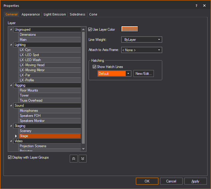
General tab
Options on the General
tab affect the layer’s color and line weight.
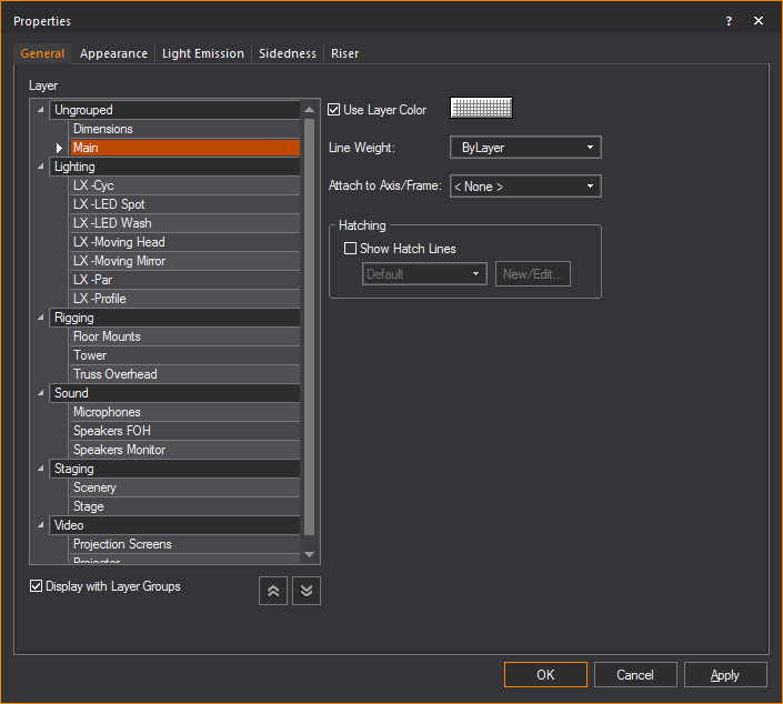
Layer
A list of the layers in your document is displayed.
Click on a list item to change the layer on which the objects will be
drawn.
- The layers are listed below the Layer Groups
if the Display with Layer Groups checkbox
is selected.
- Only the layers are listed if the Display
with Layer Groups checkbox is clear.
- Display with Layer Groups:
Select this checkbox to display the layers as items organized in Layer
Groups. Clear this checkbox to display only the list of layers.
- On the list of Layer Groups, click the arrow at
the far left to expand or collapse a single Layer Group.
- Collapse All: Click
the Collapse All button to display
only the Layer Groups.
- Expand All: Click
the Expand All button to display the
Layer Groups and all the Layers.
- Use Layer Color: Select
this checkbox to set the object’s color for Wireframe views to be
the same as the properties of the layer on which the object resides.
For more information, see Layer
properties.
- Clear this checkbox, and then use the color button
to set a specific color for the object.
- Line Weight: From
the drop-down list, choose the specific line weight for the selected
object. The applied line weight is visible in all Wireframe views
in all modes. For objects only, you can also choose the default setting,
ByLayer, which sets the object’s line
weight to be the same as the properties of the layer on which the
object resides. The value Default means
that the document's line weight setting from the Document
Options > Object Settings window
is applied to the object or layer. For more information, see Layer
properties.
- Attach to Axis:
From the drop-down list, select the motion axis to which you want
to attach the selected object or objects. For details on attaching
objects to motion axes, see To
attach an object to a motion axis.
Note: You
cannot attach Camera Paths nor Cameras to axes. To create a moving Camera,
you can either draw a Camera Path or use the DMX Camera.
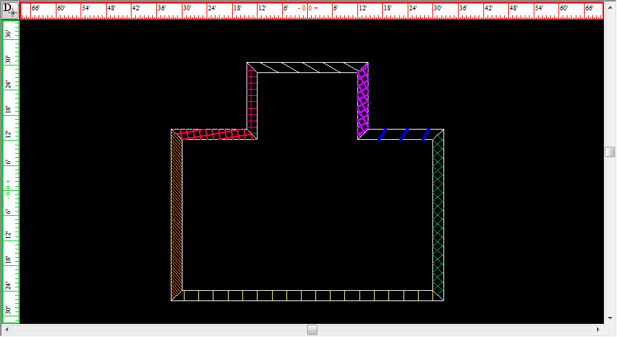
Hatching
Section for managing hatching effects of closed objects.
Note: Hatching
is only available for closed objects, e.g. surfaces, closed lines, 3D
primitives, walls.
- Show Hatch Lines:
Will enable hatching for the object.
- Available hatching styles:
A drop-down list of previously created hatching styles that can be
applied to the object.
- New/Edit...: Create
a new hatching style or edit and existing style.
To
add hatching to an object
Note: Not
all objects support hatching. If hatching is not supported, the checkbox
to enable hatching is disabled.
- Right-click the object, and select .
Result: The
Propertieswindow
appears.

- In the Properties window,
click the General tab.
- To enable hatching for the object, select the
Show Hatch Lines checkbox.
- Select the desired hatching style for the object
from the Available hatching styles
drop-down list.
- Click Apply to
enable the hatching style for the object.
To edit or create a hatching style
- Right-click an object that supports hatching,
and select .
Result: The
Propertieswindow
appears.

- In the Properties window,
click the General tab.
- To enable hatching for the object, select the
Show Hatch Lines checkbox.
- To make a new hatch style or edit an existing
style, click New/Edit....
Result: The
Hatch Style Manager window appears. All
existing hatch styles are displayed and can be edited here.

- To create a new hatch style, click the New
Hatch Style button.
 The
New Hatch Style button.
The
New Hatch Style button.
Result: The New Hatch Style window appears.
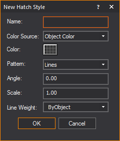
- In the New Hatch Style window,
enter the details of the new hatch style.
- Click OK.
- Click Apply to
enable the new styles.
To clone a hatching style
- Right-click an object that supports hatching,
and select .
Result: The
Propertieswindow
appears.

- In the Properties window,
click the General tab.
- Select the Show Hatch
Lines checkbox.
- Click New/Edit....
Result: The
Hatch Style Manager window appears. All
existing hatch styles are displayed and can be edited here.
- To clone an existing hatching style, select the
style you want to copy and click the Clone
Hatch Style button.
 The
Clone Hatch Style button.
The
Clone Hatch Style button.
Result: The Clone Hatch Style window appears. All
the settings of the selected hatch style will be copied into the window.
- In the Clone Hatch Style window,
edit any hatching setting that you want to be different from the original
hatching style.
- Click OK.
Result: The
cloned hatching style will appear in the Hatching
Style Manager window and be available for use.
To delete a hatching style
- Right-click an object that supports hatching,
and select .
Result: The
Propertieswindow
appears.

- In the Properties window,
click the General tab.
- Select the Show Hatch
Lines checkbox.
- Click New/Edit....
Result: The
Hatch Style Manager window appears. All
existing hatch styles are displayed.

- To delete an existing hatching style, select the
style you want to remove and click the Delete
Hatch Style button.
 The
Delete Hatch Style button.
The
Delete Hatch Style button.
Result: The Delete Hatch Style dialog box appears.
- In the Delete Hatch Style dialog
box, to delete the hatch style click Yes.
Result: The
selected hatching style be removed from WYSIWYG.
To change the print scale of hatching styles
Spacing for built-in line patterns found
in hatching use a default scale of 1.0 equal to 0’6” (2.54 cm). Print Scale Options can be used to create
a different scale when printing in PRES mode.
- Right-click an object that supports hatching,
and select .
Result: The
Propertieswindow
appears.

- In the Properties window,
click the General tab.
- Select the Show Hatch
Lines checkbox.
- Click New/Edit....
Result: The
Hatch Style Manager window appears. All
existing hatch styles are displayed.

- Click Print Scale Options.
- The Print Scale Options
dialog box appears.
- In the Print Scale Options window,
to create a custom print scale, select the radio next to Custom
scale.
Note: To revert
the print scale to its default settings, select the radio next to Print scale.
- Edit the print scale settings as desired.
- Click OK.
- Click Apply.
Result: The
print scale options change.
To import hatching patterns
To import Hatch Pattern files (.pat files),
save these files in the folder location that was entered as the Hatch Pattern Files location in the
File Locations tab in Application
Options window. When you restart WYSIWYG, these patterns will
be listed in the Hatch Style Manager.
- Right-click an object that supports hatching,
and select .
Result: The
Propertieswindow
appears.
- In the Properties window,
click the General tab.
- Select the Show Hatch
Lines checkbox.
- Click New/Edit....
Result: The
Hatch Style Manager window appears. All
existing hatch styles are displayed.

- Click Import Patterns.
Result: The
Application Options window appears.
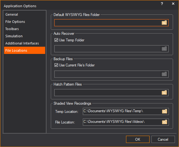
- In the Application Options
window, enter the location/folder which contains the hatch
pattern files (.pat files) in the Hatch Pattern
Files field.
- Click OK.
Result: A
dialog box appears warning that WYSIWYG needs to restart to display the
imported hatching patterns in the Hatch Style
Manager.
Appearance tab
Use this tab to specify the appearance
of the different components that make up the currently selected items.
The options in this tab differ based on your selected item.
You can use this tab to customize objects
by adding different materials, colors, or textures to each element of
the item. For example, if you have selected a library object, such as
a podium, you can apply different materials, colors, and textures to each
part of it (the body and the top portion).
You can also use this tab to rename the
individual elements of the currently selected object. This is useful for
objects that contain many elements with similar names, like risers.
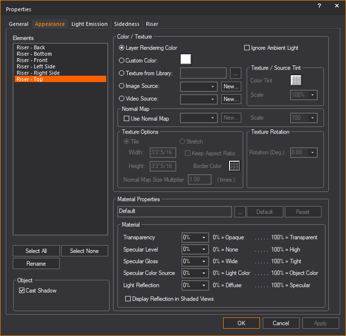
Note: You can apply
textures to venues, surfaces, risers, walls, library items, spheres, cylinders,
and cones. You can apply transparency to everything. When customizing
the selected element, you can choose between applying a custom color or
a custom texture—you cannot choose both. In addition to either color or
texture, you can also apply material.
Highlight the element that you want to
customize, and then choose one of the following options:
Color/Texture
- Ignore Ambient Light:
Select this checkbox to always show the selected element(s) in Shaded
view using the color values derived from the Appearance options
specified (e.g., texture). While light emission and light from fixtures
will further saturate the colors displayed for the selected object,
ambient light will never affect this object if this option is enabled.
This option is useful when objects (except Screens) are textured with
images or video, and these need to appear in their original colors
at all times. In renderings, this setting is ignored if Light
Emission is enabled.
- Layer Rendering Color:
Select this option to set the object(s) color for Shaded views and
renderings to the same as the properties of the layer on which the
object resides. For more information on layer properties, see Layer
properties.
- Custom Color: Select
this option and then use the color button to set a specific color
for the object(s).
- Texture from Library:
Select this option to apply a texture from the library to the selected
object(s). In the resulting window, navigate to and select the desired
texture. You can apply textures to venues, surfaces, risers, walls,
library items, spheres, cylinders, and cones. Click the ellipsis button
(...) to change the selected texture file.
- Image Source: Select
this option to apply to the selected object(s) a texture that you
have created and saved in either .bmp, .jpg, .png, or .gif format.
Select a previously created image from
the drop-down list or click New to
create a new image source from the Image Manager.
See Image
Manager
for details.
- Video Source: Select
this option to apply a video source or a subsource as a “dynamic texture”
to 3D primitives--surfaces, risers, spheres, cylinders, or cones--or
to individual elements of 3D primitives.
Select a previously created video source
or subsource from the drop-down list, or click New to
create a new video source or subsource directly from the Video
Manager. See Video
Manager
for details.
- Use Normal Map:
Select this checkbox to apply an Image Source that’s a Normal Map,
to create the perception of fragmented surface texture detail and
depth, making objects look more realistic.
Select an existing Normal Map image from
the drop-down list or click New to
create a new Normal Map image via the Image Manager.
Note: This
drop-down lists all Image Sources that appear in the Image
Manager; as such, Image Sources which are Normal Maps should be
named appropriately, for easy identification.
- Scale: Select the
height or depth of visual effect created by the Normal Map. From the
drop-down list, select the percentage scale value from not visible
(0%) to maximum value stored in the imported Normal texture/image
(100%).
If you have chosen a texture option, then
you can also set the properties of the texture as follows:
Texture Options
- Tile: Select this
option if you want to have the texture repeated over the selected
element in a continuous series of squares or rectangles, and then
type the size of the frame in which you want the texture to appear
in the Width and Height boxes.
Based on the size that you enter, WYSIWYG calculates how many times
the texture is repeated (or tiled) to completely cover the selected
element.
When tiling a texture on a sphere, cylinder,
or cone, by default it will completely wrap around the object. If you
change the tile size, you will scale the texture up or down accordingly.
If you revert back to the original tile values, you return
to the default view.
- Stretch: Select
this option to have the texture stretch over the entire element surface.
Based on the aspect ratio and the rotation angle, WYSIWYG evaluates
the surface with all of its edges and stretches the texture so the
best fit is used. Note that this option is not applicable when you
apply textures to spheres, cylinders, or cones. For these objects,
Tile is the only option.
- Keep Aspect Ratio:
Select this option to keep the aspect ratio of the original image
when it is stretched over the surface of the object you have selected.
This option helps avoid distortion of complex textures. If the texture
image cannot wrap completely over the entire surface of the object
while maintaining its original aspect ratio, then the color that you
choose in the Border Color box
will be applied evenly around any excess surface area not covered
by the texture (much like a picture frame around a picture).
- Border Color: If
you have chosen to preserve the texture’s aspect ratio, click this
box to choose the color that will be applied evenly around any excess
surface area not covered by the texture (much like a picture frame
around a picture).
- Normal Map Size Multiplier:
If you have selected Use Normal Map,
specify the number of times the Normal Map is multiplied across the
object (element) to which it is applied. Type a valid number in the Normal Map Size Multiplier box. (Enter
a valid number between 0.01 and 100.)
Notes:
- The default value of 1 results in no changes
to the Normal Map’s size; values lower than 1 will increase the size
of the Normal visual effect, and values higher than 1 will decrease
it.
- The Normal Map Size Multiplier operates
within the Tile or Stretch Texture
Options.
- Texture / Source Tint:
This option will allow the color of an object’s texture to be altered
from the source color.
- Texture Rotation: If
the texture has text or another recognizable image in it, you might
need to rotate the image to get it right-side up. Select the rotation
angle from this drop-down list.
Material Properties
Proceed with the following properties settings:
- Material: Click
the ellipsis button (...) to choose a material for the selected elements.
Click Default to remove the selected
material from the element and return to the default material. For
more information on materials, see Materials.
When a material is selected, the properties
of the material will vary from one material to the next. The Material
Properties section enables these default material settings
to be changed. Each property value can be changed on a scale from 0%-100%.
An explanation of the value is found on the right side of the property.
- Transparency: This
setting controls the proportion of light that passes though the material.
0% being completely opaque, 100% being completely clear.
Note: The
beam will pass through a surface with the Transparency value set to 80%
or greater. The beam will not pass through the surface when the value
is lower than 80%.
- Specular Level:
This setting controls how prominent other specular effects appear
on the material. 0% being no visibility of specular effects, 100%
being a maximum visibility of specular effects.
- Specular Gloss:
This settings controls the level of gloss a material will project.
0% will project the gloss over a wide area, 100% will concentrate
the gloss in a small area.
- Specular Color Source:
This setting controls the color of light projected on a material.
0% will show only the color of the light, 100% will show only the
color of the material.
- Light Reflection:
This setting controls the amount of light that is reflected off the
material. 0% having no reflection, 100% being specular.
- Display Reflection in
Shaded Views: This setting enables the display of reflections
in Shaded view. For more information see Material reflections.
Object
The Cast Shadow feature gives you the option
to display shadows and footprints of objects in Shaded view.
- Cast Shadow: Select
this checkbox to display in Shaded view the shadow/footprint of the
selected object.
Clear this checkbox if you do not want
to display in Shaded view the shadow/footprint of the selected object.
By default, Cast Shadow is enabled
on all objects, and disabled on all fixtures and hang structures.
To
rename object elements
You can use this procedure to rename object
elements that have similar names, giving them a more descriptive name.
For example, if you have customized a riser, you could give each side
of the riser a distinct name according to its custom properties. This
is especially useful for custom objects that you have drawn and are going
to save as custom library items. Since you cannot rename individual elements
of custom library items, it is best to do so before you save the item.
- Under Elements, highlight the element that you
want to rename. For example, highlight Riser
- Back.
- Click Rename.
- Type the new, descriptive name for the element.
- Click OK.
- Click OK in the
Appearance tab to save your changes.
Light
Emission tab
Options on the Light
Emission tab affect the light emission properties for the
selected object(s) or the elements that make up an object. Light emission
is defined as the ability for objects to glow or emit light and can be
used to simulate LEDs, lasers, neon, light boxes, projection screens,
and so on. Light emissions can be either Static or Dynamic.
Static light emissions can be seen in CAD,
DESIGN and unpatched LIVE mode. With Static light emissions you can choose
different light emissions for each element in an object.
Dynamic light emission can be seen in DESIGN
mode and patched LIVE mode where each element of the object inherits the
same light emission properties.
In DESIGN mode, the light emitting properties
of the entire object are controlled using the Color
Tool and the Intensity Tool. In
patched LIVE mode, the dynamic color and intensity are controlled through
DMX.
Note: Instead
of using the Properties > Light Emission tab to change the light
emission for the selected object, you can use the Quick
Light Emission Tool. For details, see Quick Light Emission Tool.
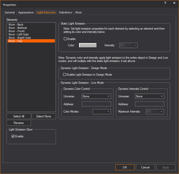
Highlight the element that you want to
customize, and then choose one of the following options:
Light Emission Glow
In this section, you can enable or disable
the Light Emission Glow feature per
object or per Element of an object.
Note: Glow must be enabled in the Light
Emission section of the Visual Effects
tab in the View Options window
to show the light emission glow effect from objects in Shaded view.
- Enable: Select
this checkbox to display in Shaded view the light emission glow effect
(Static or Dynamic) from the selected Element of the selected object.
Clear this checkbox to disable the light
emission glow effect from the selected object. By default, Light
Emission Glow is enabled for
all objects except Screens.
Tip: Screen
objects have a separate glow option, called Screen/LED
Wall Glow, which is enabled globally via the View
Options > Simulation tab
in Shaded view.
Notes:
- If Light Emission Glow is
enabled for a selected Element of an object with multiple Elements
(such as Risers, Cylinders, etc.), only the selected Element will
show the light emission glow effect in the Shaded views of DESIGN
and LIVE modes.
- The Light Emission Glow effect
is not passed on to the Renderer when you use the Render
Wizard to render the Shaded view.
Static Light Emission
- Enable: Select
this checkbox to enable Static light
emission for the object, and then choose the light emitting properties.
- Color: Click the
color box to choose the static light-emitting color for the object.
If you set only this value, and not the Dynamic Color Control, then
this is the light-emitting color that the object will have in all
Shaded views and renderings in all modes (CAD, DESIGN, LIVE). However,
if you set the dynamic color value as well, then you can control the
light-emitting color of the object in LIVE mode when connected to
a console. (The static value still applies in DESIGN mode.)
- Intensity: Choose
the static intensity of the light emission for the selected object.
If you set only this value, and not the Dynamic Intensity Control,
then this is the maximum light-emitting intensity that the object
will have in all Shaded views and renderings in all modes (CAD, DESIGN,
LIVE). However, if you set the dynamic intensity value as well, then
you can control the light-emitting intensity of the object in LIVE
mode when connected to a console. (The static value still applies
in DESIGN mode.)
Dynamic Light Emission - Design Mode
- Enable Light Emission
in Design Mode: Select this checkbox to enable the dynamic
control of the light emitting properties of the selected object with
the use of the Color Tool and the Intensity Tool. This can be defined for each
Look, and you can cross-fade with Light Emission as you can with lighting.
Dynamic Light Emission - Live mode
Dynamic light emission will apply to all
elements of an object.
- Dynamic Color Control
- Universe: When you select a value from this drop-down
list, the selected object will have light-emitting properties controllable
by three DMX channels (red, blue, green). The object must be patched
according to the WYSIWYG patch notation: universe.DMX address. From the drop-down
list, select the patch universe of the selected object, and then type
the starting DMX address in the Address box
below it. If you set this value, it overrides the static color control
that you chose above (if any) in LIVE mode when you are connected
to a console.
- Dynamic Color Control
- Address: After selecting the patch universe of the selected
object, type the starting DMX address for the patch in this box.
- Color Modes: Component
color settings are designed to be used in groups of three, meaning
that you choose the color mode for one of the surfaces and then continue
choosing color modes for the other two surfaces in the triplet, assigning
one color to each surface (either red, green or blue). If you are
not selecting colors in a group of three, choose Full
Color Mode in this drop-down list.
This feature is particularly useful to
emulate a color-mixing source with discrete red/green/blue elements, such
as fluorescent tubes or LEDs. The color mode affects how the surface responds
to the colors that you assign to it, both static and dynamic. In Full
Color mode, the surface will show the resultant color mix of the RGB channels
controlling it. For example, if you choose white in the color picker (RGB
255, 255, 255), the surface will be white. However, when you create a
triplet surface using each component color, one for each surface, and
then you choose one of the component colors, such as Component
Color - Red, then this surface will only show the red component
of the color.
- Dynamic Intensity Control
- Universe: When you select a value from this drop-down list,
the selected object will have light emitting properties to a maximum of the intensity that
you specify. The object must be patched according to the WYSIWYG patch
notation: universe.DMX address. From the drop-down
list, select the patch universe of the selected object, and then type
the starting DMX address in the Address
box below it.
- Dynamic Intensity Control
- Address: After selecting the patch universe of the selected
object, type the starting DMX address in this box.
- Dynamic Intensity Control
- Maximum Intensity: Enables you to set the maximum intensity
of patched objects. Select the intensity from the drop-down list.
The DMX intensity value is treated as a
percentage of the dynamic intensity value. For example, a DMX value of
127 results in 50% of the maximum intensity value that you set.
Quick
Light Emission Tool
Instead of using the Properties >
Light Emission tab to change the selected
object’s light emission, you can use the Quick
Light Emission Tool. These tools allow you to quickly assign or
change light emission properties for the selected object without opening
the Properties window. You can enter
repetitive information, as well as incremental information for each object
as you click on it.
Note: The
Quick Light Emission Tool applies
light emission properties to the entire object. All elements of the object
will be assigned the same color when using the Quick
Light Emission Tool.
To use the Quick Light Emission Tool
- From the menu,
choose .
Tip: You can
also click the Quick Light Emission Tool from the Tools toolbar.
 The Quick
Light Emission Tool button.
The Quick
Light Emission Tool button.
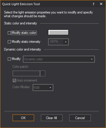
Select the light emission properties for
the selected object. For details on each of the options, see Light Emission tab. If you want the
value to auto increment for color, make sure you select the Auto
Increment checkbox. WYSIWYG will assign the next sequential
number based on the properties and requirements of the previous patch.
- When you have chosen all desired values, click
OK.
Sidedness
tab
Options on the Sidedness tab
affect how the selected object appears in Shaded views and Renderings.
You cannot change the sidedness of any of the objects that come with WYSIWYG,
either library objects or default venues. By default, all objects in the
WYSIWYG library are double-sided, which means that when you rotate them
in Shaded views, all sides display equally. Conversely, the default venues
that come with WYSIWYG are single sided, which enables you to see “into”
the venue when you rotate it in Shaded views.
You can, however, change the sidedness
of objects that you have drawn in another program and imported into WYSIWYG
(i.e., .dwg, .dxf files or SketchUp files) or objects that you have drawn
in WYSIWYG, such as custom venues, surfaces or custom objects that you
have added to the library.
For these objects, you can use this tab
to change the sidedness from single to double-sided, or vice versa. For
example, if you have drawn a venue as double-sided, you can select it
and change it to single sided so that it behaves in the same manner as
the default WYSIWYG venues (i.e., you can see into the venue as you rotate
it in Shaded views). If you prefer to have an outside view of the custom
venue, then the double-sided option is best as it prevents you from seeing
“through” the walls. You can also use this feature to flip the faces of
a custom surface from one direction to the other if you do not like the
way the object appears in the Shaded view.
To
change an object’s sidedness
You can use this procedure to change objects
from single to double sided and vice versa. You can also flip the faces
of a single-sided object so that they are oriented in the opposite direction,
either inward or outward.
Note: You
cannot change the sidedness of any of the objects that come with WYSIWYG,
either library objects or default venues. By default, all objects in the
WYSIWYG library are double-sided, which means that when you rotate them
in Shaded views, all sides display equally. Conversely, the default venues
that come with WYSIWYG are single sided, which allows you to see “into”
the venue when you rotate them in Shaded views.
- Select the object that you want to edit.
- Right-click on the object, and then select .
Tip: At any
time, to access an object’s properties, you can click on the Properties tool
on the Edit toolbar.
 The Item Properties button.
Result: The
Properties window appears.
- Click the Sidedness
tab.
- Click the appropriate option button, either Double Sided or Single
Sided. To leave the single-sided object’s faces oriented in
the same direction in which they were drawn, proceed directly to step
6. To change the direction of the faces, see step 5.
- If you are changing a double-sided object to single
sided, and you want to change the direction in which the object’s
faces are oriented (either outward or inward), select the Flip
Normal checkbox.
- Click OK.
- Review your changes in the Shaded tab
and make adjustments as required.
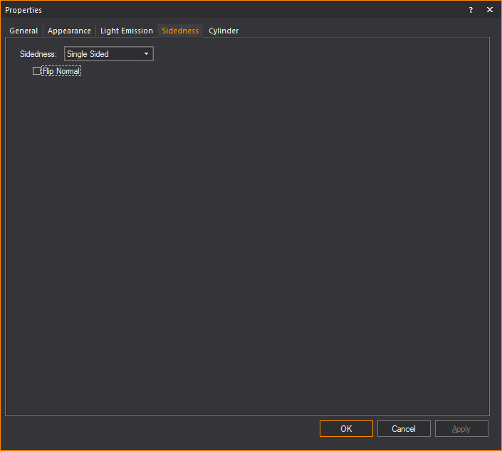
- Sidedness: Choose
the sidedness of the selected object:
- Double Sided:
Select this option to turn the single-sided object into a double-sided
object. Note that you cannot change WYSIWYG’s default venues from
single to double sided.
- Single Sided:
Select this option to turn the double-sided object into a single-sided
object. For example, if you have created a custom surface/wall/venue
and have imported it as a double-sided object into WYSIWYG, you can
select it and make it single sided so you can see “into” the venue
when you rotate it in Shaded views. Note that you cannot change any
of WYSIWYG’s library objects from double to single sided.
- Flip Normal: If
you have imported a custom-drawn object or drawn an object in WYSIWYG
and you see in the Shaded view that it appears incorrectly (the “faces”
showing the texture/color are pointing inward), select this checkbox
to flip the faces in the opposite direction, and then look at the
object in the Shaded view again.
Object-specific
properties
As explained above, objects also have properties
that are particular to the type of object. For example, fixtures have
unit numbers but do not have a radius. When an object is selected and
its properties are displayed, a tab appears in the properties dialog box
for that type of object. When you select multiple objects of different
types, tabs appear for each type of object selected.
The following objects are defined:
- points
- lines
- cones
- spheres
- text labels
- dimensions
- axes and motion frames
For all other types of objects (venues,
circles, arcs, risers, cylinders, and cameras), refer to Drawing
objects. In these cases, the properties dialog box offers the
same options that were given when the object was initially drawn.
Hanging structures properties (pipes, truss,
floor mounts, and so on) are fully defined in Hang structures.
Fixtures and lighting-specific object properties
are fully defined in the Fixture
properties
section.
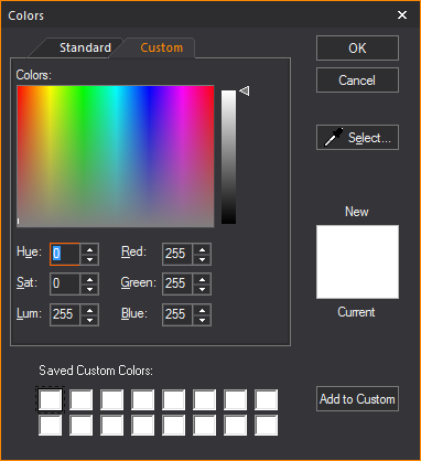
Colors window
The Colors window
allows for full customization and control over colors used in WYSIWYG.
From here the color of any object in WYSIWYG can be changed. This section
will explain the various features of the color window.
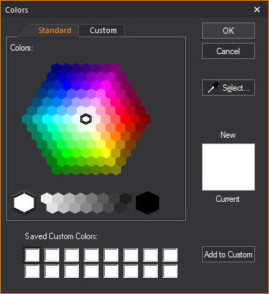
- Standard: A hexagon
of basic colors and shades available for selection.
- OK: Will confirm
the use of a new color to replace the current color.
- Cancel: Will exit
the color window without making a color selection.
- Select...: This
option is used to gather a custom color sample from anywhere on your
desktop. This option will turn the cursor into a dropper from which
colors can be gathered.
- New: Color selected
in the Color window.
- Current: The color
that is currently in use.
- Saved Custom Colors:
A saved palette of custom colors.
- Add to Custom:
Will save selected New color to the Saved Custom Colors palette.
- Custom: Section
for editing a selected color’s properties.
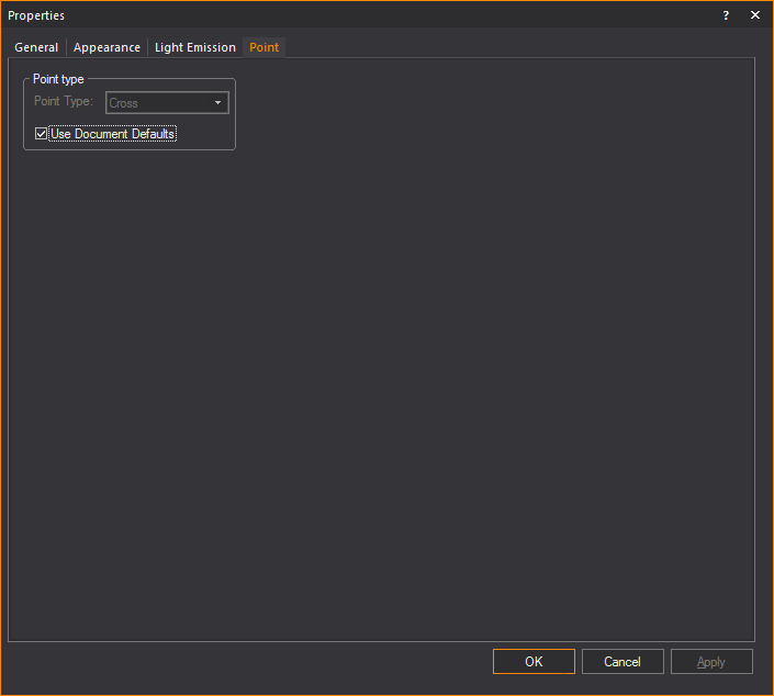
Point tab
Options on the Point tab
affect how the selected point is drawn. The default point type used in
a document is defined on the Object Settings tab
of Document Options. To ignore the default
setting, clear the Use Document Defaults checkbox,
and then select the desired point type.
Line
tab
Options on the Line tab
affect how the selected line is drawn.
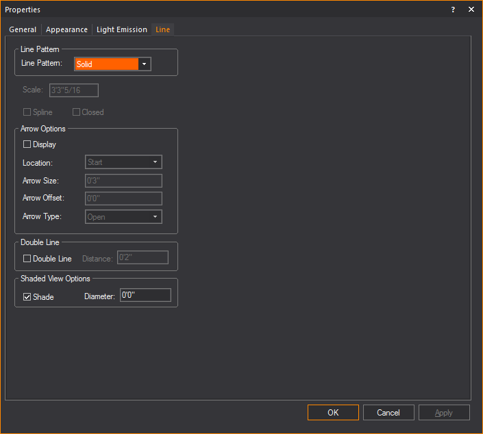
Line Pattern
- Line Pattern: Choose
a line pattern for the selected lines. For an illustration of each
line pattern, see Drawing
lines.
Note: Line
patterns are available for a Rectangle, Circle, Ellipse, and Arc or Elliptical
Arc, in the corresponding Properties windows.
Line patterns are available to a Closed Line Polygon
from the Line tab of its Properties
window.
- Scale: Type a value
in this box to change the length and spacing of dots and dashes for
the selected lines. This value is applicable to center, hidden, or
dot lines only.
- Spline: Select
the Spline checkbox to transform
a line into a spline or French curve.
- Closed: Select
the Closed checkbox to quickly
connect the first point of a multi-segment line to the last point
of that line.
Note: You
cannot change a line to a spline or French curve unless the selected line
has more than two vertices.
Arrow Options
How arrows attached to the line will be
shown.
- Display: Select
this checkbox to show an arrow at the end(s) of the line.
- Location: Where
the arrow will appear on the line.
- Arrow Size: How
large the arrow will appear.
- Arrow Offset: How
far away the arrow if from the line.
- Arrow Type: The
style of arrow that will be displayed.
Double Line
- Double Line: Select
this checkbox to display the line as a double line.
- Distance: How far
apart the double lines will be from each other.
Shaded View Options
- Select the Shade checkbox
to display the selected line(s) in Shaded views and renderings, and
in the Diameter box, type a value
for the radius to set its thickness.
Cone tab
Options on the Cone
tab affect how the object is drawn.
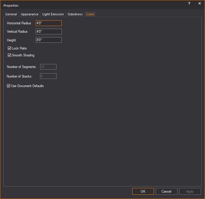
- Horizontal Radius:
Type a value to change the width of the base surface.
- Vertical Radius:
Type a value to change the depth of the base surface.
- Height: Type a
value to change the height of the cone.
- Lock Ratio: Select
this checkbox to lock the shape proportion when the size of the cone
is changed.
- Smooth Shading:
Select this checkbox to display a smooth appearance in Shaded view.
- Number of Segments:
Type a value to change the number of vertical divisions that appear
when the cone is broken into surfaces, set pieces, or lines.
- Number of Stacks:
Type a value to change the number of horizontal divisions that appear
when the cone is broken into surfaces, set pieces, or lines.
- Use Document Defaults:
Clear this checkbox if you want to specify the Number of Segments
and the Number of Stacks.
Sphere tab
Options on the Sphere
tab affect how the object is drawn.
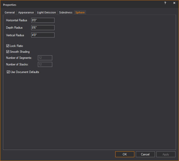
- Horizontal Radius:
Type a value to change the width of the middle of the sphere or equator.
- Depth Radius: Type
a value to change the horizontal depth of the middle of the sphere
or equator.
- Vertical Radius:
Type a value to change the vertical depth of the middle of the sphere
or equator.
- Lock Ratio: Select
this checkbox to lock the shape proportion when the size of the sphere
is changed.
- Smooth Shading:
Select this checkbox to display a smooth appearance in Shaded view.
- Number of Segments:
Type a value to change the number of vertical divisions that appear
when the sphere is broken into surfaces, set pieces, or lines.
- Number of Stacks:
Type a value to change the number of horizontal divisions that appear
when the sphere is broken into surfaces, set pieces, or lines.
- Use Document Defaults:
Clear this checkbox if you want to specify the Number of Segments
and the Number of Stacks.
Text
Label tab
Options on the Text
Label tab affect the information, justification and style
of the selected text labels.
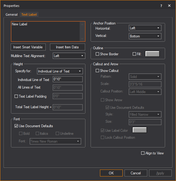
- Text Label: Type new text to change the label.
- Use SHIFT+ENTER
to type on the next line.
- Use ENTER to
close the dialog box (equivalent to the OK
button).
- Insert Smart Variable:
Open the Smart Variables window
and select a smart variable text from the table of smart variables
that are listed in the Production Team Info tab
in Document Options.
- Insert Item Data:
Open the Item Data window and
select data from the list of retrieved properties of selected fixtures
and trusses.
- Multiline Text Alignment:
How the text in the Text field will
be aligned.
Height
Section for controlling the height of the text label.
- Specify for: Choose
how you would like to specify the height of the Text Label.
- Individual Line of Text:
Sets the height for a single line of text.
- All Lines of Text:
Sets the total height of all lines of text.
Example: If you set
this to 4' and there are 4 lines of text, then each line of text will
be 1' in height.
- Text Label Padding:
Adds space between the text and the text label border.
- Total Text Label Height:
The height of the text and text label padding combined.
Font
Section for controlling the font settings
of the text label.
- Use Document Defaults:
Clear this checkbox to choose the default font and font styles for
all text labels, and then make your selections.
Anchor Position
Section for controlling how the text label
is anchored.
- Horizontal:
Select the Text label’s horizontal alignment from the drop-down list.
The available horizontal alignment options are:
Left: Places the selected
text label to the left of the insertion point.
Center: Horizontally
centers the selected text label on the insertion point.
Right: Places the
selected text label to the right of the insertion point.
- Vertical: Select the text label’s vertical
alignment from the drop-down list. The available vertical alignment
options are:
Top: Places
the selected text label below the insertion point.
Center:
Vertically centers the selected text label on the insertion point.
Bottom:
Places the selected text label above the insertion point.
Outline
- Show Border: Select
this checkbox to display a border around the text label.
- Fill: Select this
checkbox and click on the color box to add a fill color to the background
of the text label.
Callout and Arrow
Section for
controlling how callout lines and arrows attached to the line will be
shown.
- Show Callout:
Select this checkbox to display the text label with a callout line.
- Pattern: The pattern
of the callout line.
- Scale: The dimension
at which the callout pattern is to be viewed at making it legible.
- Callout Position:
The position on the text label where the callout will extend.
- Show Arrow: Select
this checkbox to show an arrow at the end of the callout.
- Style: The style
of the callout arrow that will be displayed.
- Size: How large
of the callout arrow that will appear.
- Use Label Color:
When selected will use the same color as the text label for the callout.
If not selected a different color can be chosen.
- Lock Callout Position:
When selected will lock the position of the callout when the text
label is moved.
- Align to View:
Select this checkbox to set the text labels to be legible regardless
of plot type.
Linear
Dimension tab
Options on the Linear Dimension tab affect the appearance
and measurement mode of the selected dimension. To change the length of
a dimension, it must be stretched in the drawing.
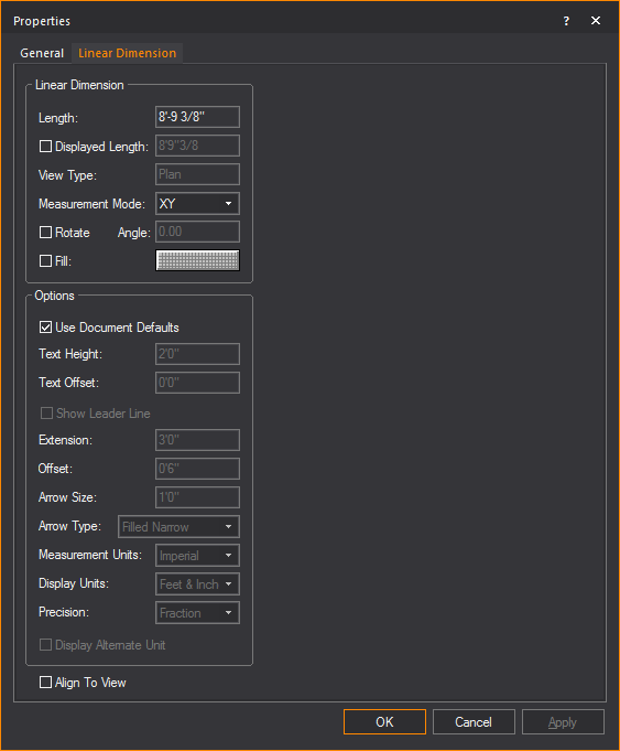
Linear Dimension
View and change how the linear dimension
is displayed.
- Length: This
box is not editable. It displays the actual length of the line drawn
for the dimension.
- Displayed Length: Select
this checkbox and type a value you wish to display.
- View Type: This
box is not editable. It displays the plot type in which the dimension
label is visible, which is determined when the dimension is drawn.
- Measurement Mode: Specify
the view in which the dimension will be visible. Measurement modes
are explained in Drawing
dimension objects.
- Rotate: Select
the checkbox to rotate the linear dimension.
- Angle: Type the
angle of rotation.
- Fill: Select
the checkbox and click the color select box to change the fill color
behind the dimension text.
Options
Customize the other elements of the linear
dimension.
- Use Document Defaults: Toggle
this option to specify whether the dimension is to use default document
settings as configured in the Dimension Styles tab, or use custom
settings.
- Text Height: The
height of the text used in the dimension.
- Text Offset: The
positive or negative offset of the text.
- Show Leader Line: Select
this checkbox to display the leader line which indicates the text
to the linear dimension.
- Extension: The
length of the extension lines.
- Offset: The
distance from extension line from the object being measured.
- Arrow Size: The
size of the arrow head used on the dimension.
- Arrow Type: The
style of arrow head used on the dimension.
- Measurement Units: Measurement
modes are explained in Drawing
dimension objects. Select Imperial or
Metric to change the measurement units.
- Display Units: The
preferred way to display measurements. For Imperial measurements,
choose between Feet & Inches, or just Inches; For Metric, the
options are Meters, Centimeters or Millimeters.
- Precision: Specify
the measurement precision of the dimension line. Based on your choice
for measurement units, you can choose to display the drawing resolution
in centimeters, millimeters, whole numbers, or fractions.
- Display Alternate Unit: Select
this checkbox to display the alternate unit.
- Align To View:
The orientation of the text used in the dimension. Select this checkbox
to set the horizontal alignment of the text to match your view.
Arc
Length Dimension tab
Options on the Arc
Length Dimension tab affect the appearance and measurement
mode of the selected arc length dimension. The arc length dimension can
only be changed when the arc itself changes.
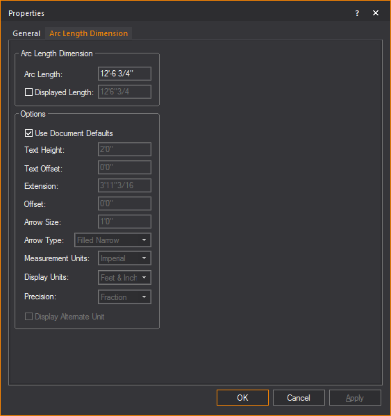
Arc Length Dimension
- Arc Length: This
box is not editable. It displays the actual length of the arc to which
the dimension is attached.
- Displayed Length:
Select this checkbox and type a value you wish to display.
Options
- Use Document Defaults:
Toggle this option to specify whether the dimension is to use default
document settings as configured in the Dimension
Styles tab, or use custom settings.
- Text Height: The
height of the text used in the dimension.
- Text Offset: The
positive or negative offset of the text.
- Extension: The
length of the extension lines.
- Offset: The distance
from extension line from the object being measured.
- Arrow Size: The
size of the arrow head used on the dimension.
- Arrow Type: The
style of arrow head used on the dimension.
- Measurement Units:
Measurement modes are explained in Drawing
dimension objects. Select Imperial or
Metric to change the measurement units.
- Display Units:
The magnitude of scale which measurements will be shown, e.g. feet
or inches.
- Precision: Specify
the measurement precision of the dimension line. Based on your choice
for measurement units, you can choose to display the drawing resolution
in centimeters, millimeters, whole numbers, or fractions.
- Display Alternate Unit:
Select this checkbox to display the alternate unit.
Radial Dimension tab
Options on the Radial
Dimension tab affect the appearance and measurement mode of
the selected radial dimension. The radial dimension can only be changed
when the circle or arc itself changes.
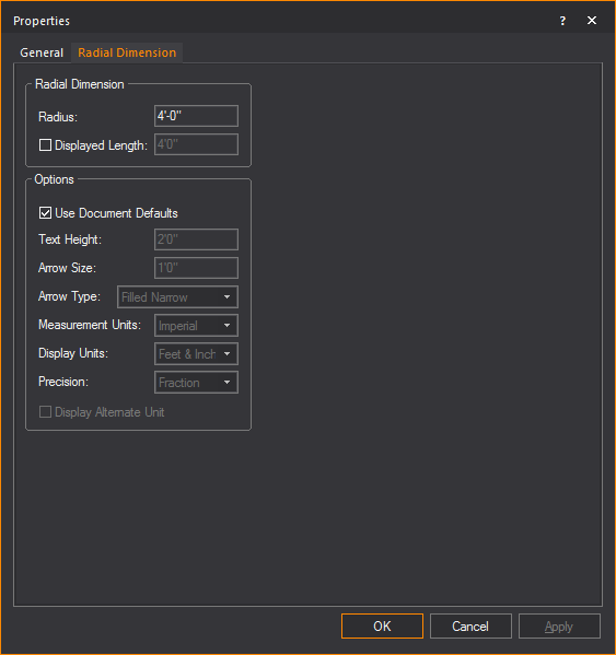
Radial Dimension
- Radius: This box
is not editable; it displays the actual radius of the circle or arc
to which the dimension is attached.
- Displayed Length:
Select this checkbox and type a value you wish to display.
Options
- Use Document Defaults:
Toggle this option to specify whether the dimension is to use default
document settings as configured in the Dimension
Styles tab, or use custom settings.
- Text Height: The
height of the text used in the dimension.
- Extension: The
length of the extension lines.
- Offset: The distance
from extension line from the object being measured.
- Arrow Size: The
size of the arrow head used on the dimension.
- Arrow Type: The
style of arrow head used on the dimension.
- Measurement Units:
Measurement modes are explained in Drawing
dimension objects. Select Imperial or
Metric to change the measurement units.
- Display Units:
The magnitude of scale which measurements will be shown, e.g. feet
or inches.
- Precision: Specify
the measurement precision of the dimension line. Based on your choice
for measurement units, you can choose to display the drawing resolution
in centimeters, millimeters, whole numbers, or fractions.
- Display Alternate Unit:
Select this checkbox to display the alternate unit.
Angle Dimension tab
Options on the Angle
Dimension tab affect the appearance and measurement mode of the
selected protractor object.
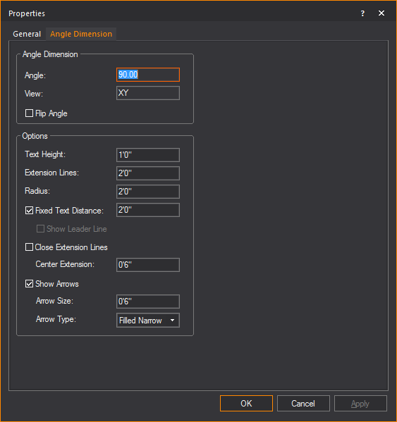
Angle Dimension
Displays the actual measurements of the
Angle Dimension.
- Angle: This box
is not editable; it displays the angle as measured by the Angle Dimension.
- View: The box is
not editable; it displays the view that the angle was drawn in. Angles
are only visible as long as they are drawn in a views coplanar to
either XY, XZ, or YZ planes.
- Flip Angle: Toggle
this option to switch between measuring the interior and exterior
angle defined by the Angle Dimension.
Options
Specify display settings of the Angle Dimension.
- Text Height: Type
a value to change the height of the text displayed by the angle dimension
tool.
- Extension Lines:
Type a value to change the length of the extension lines.
- Radius: Type a
value to change the radius of the angle dimension arc.
- Fixed Text Distance:
Toggle this option to specify a fixed distance from the text to the
middle of the arc.
- Show Leader Line:
Clear the Fixed Text Distance checkbox
and toggle this option to display the anchored center line.
- Close Extension Lines:
Toggle this option to close the center extension or to specify the
length of the center extension.
- Show Arrows: Toggle
this option to display the arc with arrows. You can specify the size
of the arrow and choose the arrow type from the drop-down list.
Axis tab
Options on the Axis tab
affect the appearance of the selected axis. The Axis tab
also enables you to specify the patch settings for the selected axis.
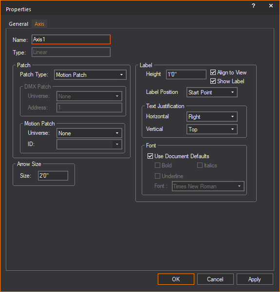
- Name: Modify this
property to change the name of the axis.
- Type: Indicates
the type of axis. Can be one of Linear or Rotation.
Patch
- Patch Type: Allows
you to specify which patch type you want. Can be one of DMX or Motion
Patch. If DMX Patch is selected
then the DMX Patch area will be enabled while the Motion Patch is
disabled.
- DMX Patch - Universe:
Select the DMX Universe to which you want to bind the axis. The Universe
must be created in DATA mode.
- DMX Patch - Address:
Specify the starting address of the axis object. Linear and Rotational
axes take up two channels in a DMX universe (Move, Move Fine).
- Motion Patch – Universe:
Select the Motion Control Universe to which you want to bind the axis.
The Universe must be created in DATA mode.
- Motion Patch - ID:
Specify the root ID of the axis. Linear and Rotational axes will take
up one slot in the Motion Control Universe.
Arrow Size
- Size: Type a value
to change the size of the arrow on a selected linear axis.
Label
- Height: Type the
height of the text associated with the axis.
- Align to View:
Select this checkbox to align the axis to the specific view that it
is in (i.e. Side, Front, Back, Iso).
- Show Label: Select
this checkbox to display the label text of the axis.
- Label Position:
Choose where to place the label text along the axis.
- Text Justification- Horizontal:
Choose how the label text is aligned horizontally to the axis.
- Text Justification - Vertical:
Choose how the label text is aligned vertically to the axis.
- Font: Clear the
Use Document Defaults checkbox
to change the font face of the label text, or leave the Use
Document Defaults checkbox selected to use defaults.
Frame tab
Options on the Frame tab
affect the appearance of the selected frame. The Frame tab
also enables you to specify the patch settings for the selected frame.
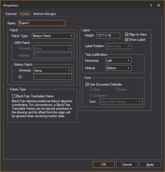
- Name: Modify this
property to change the name of the frame.
Patch
- Patch Type: Allows
you to specify which patch type you want. Can be one of DMX or Motion
Patch. If DMX Patch is selected
then the DMX Patch area will be enabled while the Motion Patch is
disabled.
- DMX Patch - Universe:
Select the DMX Universe to which you want to bind the frame. The Universe
must be created in DATA mode.
- DMX Patch - Address:
Specify the starting address of the frame object. Frames
take 12 channels (X, X Fine, Y, Y Fine, Z, Z Fine, Rx, Rx Fine, Ry,
Ry Fine, Rz, and Rz Fine).
- Motion Patch – Universe:
Select the Motion Control Universe to which you want to bind the frame.
The Universe must be created in DATA mode.
- Motion Patch - ID:
Specify the root ID of the frame. Frames will take up 6 slots in the
Motion Control Universe, where each slot will take the form of ID:X,
ID:Y, ID:Z, ID:Rx, ID:Ry, and ID:Rz.
Frame Type
- BlackTrax Trackable Frame:
Select this checkbox to set the frame for BlackTrax and associate
with a BlackTrax Trackable.
Label
- Height: Type the
height of the text associated with the frame.
- Align to View:
Select this checkbox to align the frame to the specific view that
it is in (i.e. Side, Front, Back, Iso).
- Show Label: Select
this checkbox to display the label text of the frame.
- Label Position:
Choose where to place the label text along the frame.
- Text Justification- Horizontal:
Choose how the label text is aligned horizontally to the frame.
- Text Justification - Vertical:
Choose how the label text is aligned vertically to the frame.
- Font: Clear the
Use Document Defaults checkbox
to change the font face of the label text, or leave the Use
Document Defaults checkbox selected to use defaults.
Motion Ranges
tab
Options in the Motion
Ranges tab enable you to modify the allowed ranges of motion
for the selected Frame.
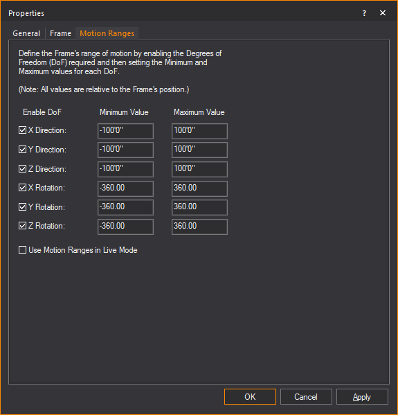
- X Direction: Select
this checkbox to allow linear movement along the X axis. Edit the
minimum and maximum extents to define the Frame’s motion range.
- Y Direction: Select
this checkbox to allow linear movement along the Y axis. Edit the
minimum and maximum extents to define the Frame’s motion range.
- Z Direction: Select
this checkbox to allow linear movement along the Z axis. Edit the
minimum and maximum extents to define the Frame’s motion range.
- X Rotation: Select
this checkbox to allow rotations around the X axis. Edit the minimum
and maximum extents to define the Frame’s motion range.
- Y Rotation: Select
this checkbox to allow rotations around the Y axis. Edit the minimum
and maximum extents to define the Frame’s motion range.
- Z Rotation: Select
this checkbox to allow rotations around the Z axis. Edit the minimum
and maximum extents to define the Frame’s motion range.
- Use Motion Ranges in Live
Mode: When disabled, the specified motion ranges will only
be enforced in DESIGN mode, giving you the full free range of motion
in LIVE mode. When enabled, the specified ranges of motion will be
enforced in LIVE mode as well.
Textures
You can apply textures to different objects,
such as venues, surfaces, 3D primitives, and library objects. Surfaces
are created using the Surface tool,
or by extruding a line. The textures provided with WYSIWYG emulate various
types of surfaces, such as brick or cloth. You can also use your own bitmap
or jpeg files as textures, to emulate projection screens, or to cover
a surface with a texture specific to your show.
When customizing an object, you can apply
either a color or a texture;
you cannot apply both.
To apply a texture
to a surface
The following procedure details how to
apply a texture to a surface, but it can also be used to apply a texture
to venues, risers, walls, library objects, spheres, cylinders, or cones
by right-clicking, and then selecting .
In order for textures to be displayed properly
on surfaces, the surface must be drawn in a counter-clockwise direction.
For details, see To
draw a surface.
- Right-click the surface to which you want to apply
a texture, and then choose .
- Click the Appearance tab.
- Select the texture option that you want. The options
are:
- Texture from Library:
Indicates that the selected surface is a texture from the WYSIWYG
library. The texture name appears in the box provided. Click the ellipsis
button (...) to modify the selected surface.
- Image Source:
The selected surface uses a texture from an external bitmap or jpeg
file on your hard drive rather than one from the WYSIWYG library.
From the drop-down list, select from the images stored and available
in Image Manager or click New to create a new image source in
Image Manager.
- Video Source:
The selected surface uses a texture from a live or pre-recorded video
source. From the drop-down list, select from the video files stored
and available in Video Manager, or
click New to create a new video
source in the Video Manager.
- Use Normal Map:
The selected surface uses an Image Source that’s a Normal Map, to
create the perception of fragmented surface texture detail and depth,
making objects look more realistic.
From the drop-down list, select to apply
an existing Normal Map image or click New to
create a new Normal Map image via the Image Manager.
Note: This
drop-down lists all Image Sources that appear in the Image
Manager; as such, Image Sources which are Normal Maps should be
named appropriately, for easy identification.
From the Scale
drop-down list, select the height or depth of visual effect created
by the Normal Map. From the drop-down list, select the percentage scale
value from not visible (0%) to the maximum value stored in the imported
Normal texture/image (100%).
- Select Tile to
have the texture repeated over the selected element in a continuous
series of squares or rectangles, and then type the size of the frame
in which you want the texture to appear in the Width and
Height boxes. Based on the size
that you enter, WYSIWYG calculates how many times the texture is repeated
(or tiled) to completely cover the selected element.
OR
Select Stretch to
make the selected texture grow to cover the entire surface. Based on the
aspect ratio and the rotation angle, WYSIWYG evaluates the surface with
all of its edges and stretches the texture so the best fit is used. This
option is not active unless you choose a texture. You cannot choose this
option for spheres, cylinders, or cones. If you choose this option, you
can also choose the following:
- Aspect Ratio:
Click this option to preserve the aspect ratio of the original texture
image when it is stretched over the surface of the object you have
selected. This option helps avoid distortion of complex textures.
If the texture image cannot wrap completely over the entire surface
of the object while maintaining its original aspect ratio, then the
color that you choose in the Border Color box
will be applied evenly around any excess surface area not covered
by the texture (much like a picture frame around a picture).
- Border Color:
If you have chosen to preserve the texture’s aspect ratio, click this
box to choose the color that will be applied evenly around any excess
surface area not covered by the texture (much like a picture frame
around a picture).
- Normal Map Size Multiplier:
If you applied a Normal Map texture, specify the number of times the
Normal Map is multiplied across the object (element) to which it is
applied. Type a value in the Normal Map Size
Multiplier box. (Enter a valid number between 0.01 and
100.)
The default value of 1 results in no changes
to the Normal Map’s size; values lower than 1 will increase the size of
the Normal visual effect, and values higher than 1 will decrease it.
The Normal Map
Size Multiplier operates within the Tile or
Stretch Texture Options.
Note: Textures
from a single image source can be applied to fit curved surfaces that
were extruded from arcs and splines. For more information, see Extrude.
- If the texture has text or another recognizable
image in it, you might need to rotate the image to get it right-side
up. Select the rotation angle from the Texture
Rotation drop-down list.
- Click OK.
Alpha mapping
WYSIWYG supports simple Alpha Mapping with
PNG images. In Shaded view, camera view can look through and lighting
beams can pass through transparent sections of these images that were
set as textures.
Alpha Level supports Alpha Blending for
Camera on surfaces with transparency. Two overlapping translucent surfaces
will be displayed accurately showing the levels of intersecting transparencies.
When Alpha Beam Shadows is enabled, alpha
fill percentage/value in images are utilized when altering the beam’s
color and intensity as it passes through the surface. See Simulation
tab in Shaded views.
Beams do not handle different levels of
Alpha fill. Beams will only pass through the images with Alpha fill level
between 0 and 127 of 255.
In a PNG image file:
- Areas of the image filled with any level of transparency
will work correctly as transparent or semi-transparent textures in
Shaded view.
- Areas of the image filled with higher transparency
(Alpha fill level between 0 and 127 of 255) will allow beams to pass
through.
- Areas of the image filled with lower transparency
(Alpha fill level between 128 and 255) will not allow beams to pass
through.
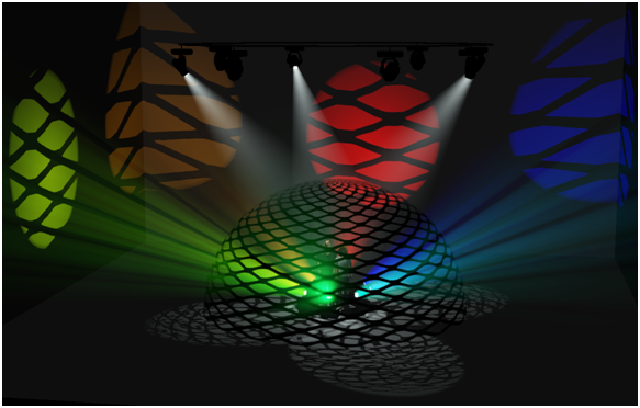
Notes:
- Each alpha shadow level supported for this feature
requires additional video memory from your graphics card, which can
impact performance depending on your scene and computer hardware.
- Alpha Texturing is supported with PNG images
containing alpha transparency built into the image. For more information
about using Alpha Textures, please see http://forums.cast-soft.com/index.php?threads/using-alpha-in-r38.662/.
- The
Image Manager window preview will
display a grey checker pattern to identify the alpha levels that are
defined in the image.
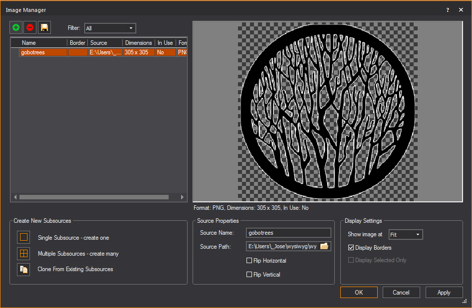
Normal mapping
Normal Map images may be applied to objects
to make them appear three-dimensional without actually modifying their
geometry; the perceived visual effect is that of a fragmented surface
with high and low points that correctly interact with light.
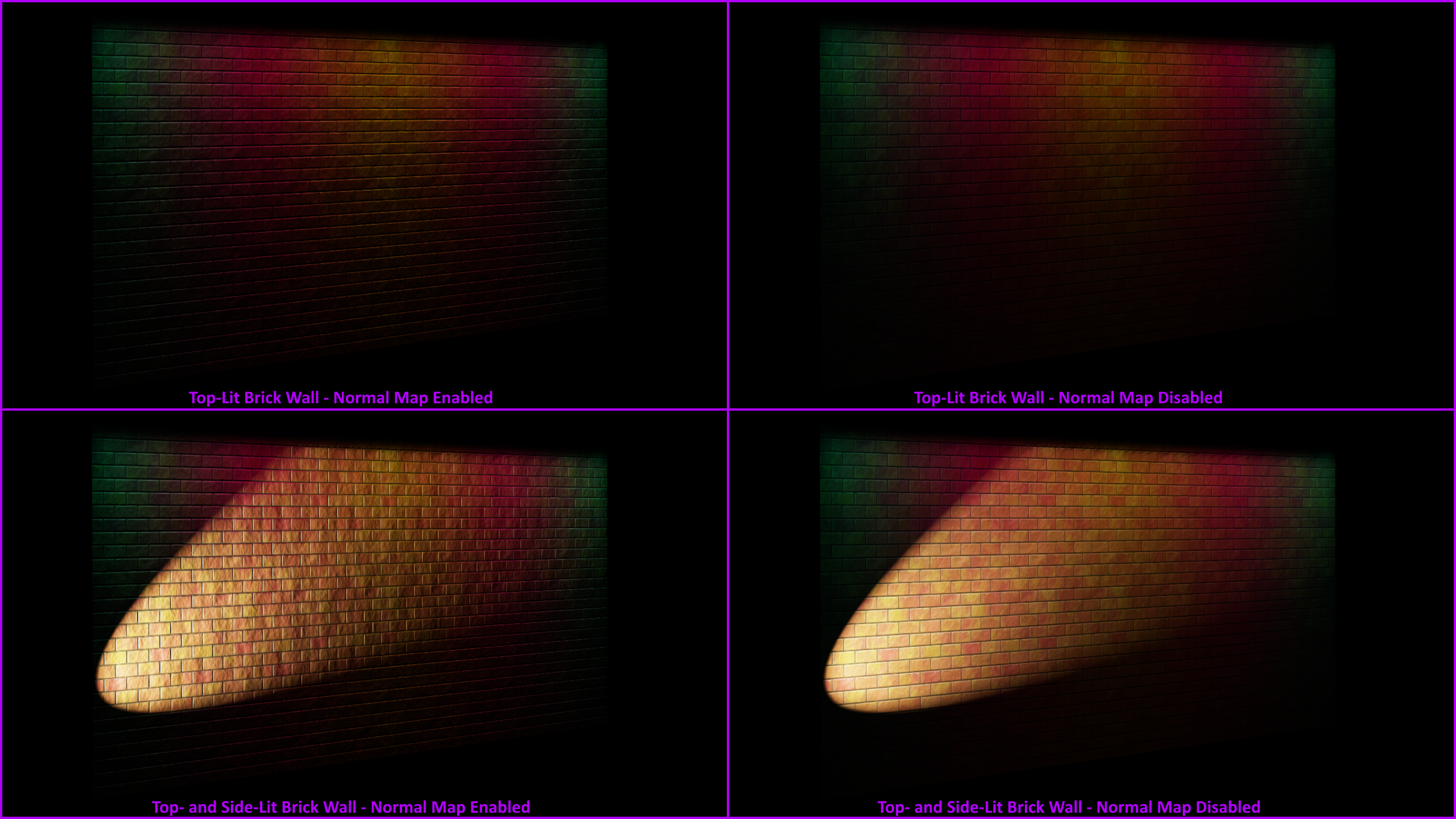
Materials
Materials differ from textures in that
they do not affect what the objects or surfaces will look like, but rather
how they interact with light. The result of applying a material is only
apparent in renderings and in Shaded view. Below is an example of a rendering
with materials included:
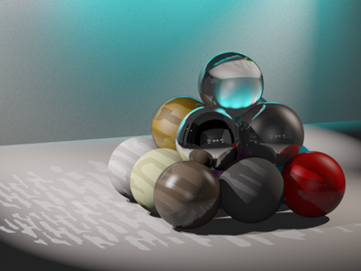
Objects and surfaces can be assigned both
a texture and a material. You apply materials using the Appearance tab
in the Properties dialog box. You can choose
your preferred material from the list of materials provided with WYSIWYG.
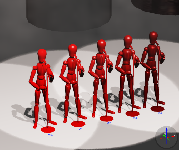
A sample of mannequins, exactly the same except
for the material applied: M0 default settings, M1 Metal 1 (Dull),
M2 Metal 2, M3 Metal 3, M4 Metal 4 (Shiny).
To toggle materials in shaded view
- In view,
from the menu, choose
- In the Simulation tab,
select the Enable checkbox in
the Materials section to display
materials in Shaded view.
To apply a material to an object (surface, object, or venue)
- Right-click the object which you want to apply
the material to, and then choose .
Result: The
Properties window appears.
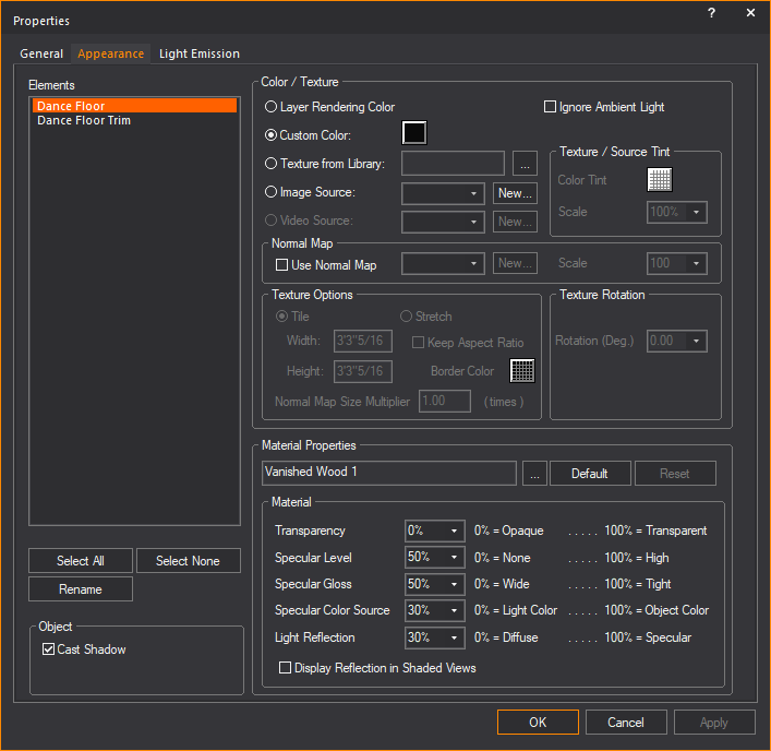
- In the Properties window,
click the Appearance tab.
- From the Elements list
box, choose the elements to which you want to apply the material.
To choose a custom material for the selected elements (such as metal,
paper, plastic, or fabric) click the ellipsis button (...)
beside the Material box.
Result: The
Material Select window appears.
Tip: When
a material is highlighted in the Material Select
window, a preview of the material applied to objects is displayed.
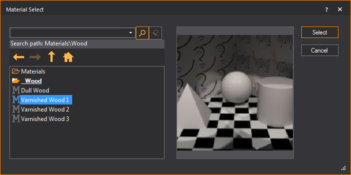
- In the Material Select
window, navigate to and highlight the desired material, and
then click Select.
Result: The
settings of the element will be configured so that it simulates the material.
- If desired, you can edit the default properties
of the selected element. The element options vary as follows:
- Transparency:
This setting controls the proportion of light that passes through
the material.
- Specular Level:
This setting controls how prominent other specular effects appear
on the material.
- Specular Gloss:
This settings controls the level of gloss the material will project.
- Specular Color Source:
This setting controls the color of light projected on the material.
- Light Reflection:
This setting controls the amount of light that is reflected off the
material.
Note: From
the drop-down lists, you can change any of the material properties. Use
the Reset button to revert back to defaults.
- Click Apply.
- Click OK.
Material reflections
The reflective properties of a material
can be toggled to enable true reflections in Shaded view. When enabled,
the material will produce a detailed and faithful representation of everything
reflected on its surface.
Attention:
- The number of reflective material surfaces that
WYSIWYG can support is 10. When enabling
reflections on an object, note the number of surfaces that make up
the object. For example, a cube has 6 sides. If an entire cube was
to be reflective, it would use 6 reflective surfaces.
- This limit of 10 reflective
elements is in effect to prevent the Shaded view performance from
degrading to unacceptable levels. Reflections work by rendering each
frame for the Shaded view (to the screen, this has no connection with
Rendering in the Render Wizard) over and over within
each reflective element.
- The Shaded view will be rendered twice per frame
if you add one reflective element; three renderings per Shaded view
frame if you add a second reflective element; four renderings per
Shaded view frame if you add a third reflective element; and so on,
up to the maximum of 10 reflections
which require eleven renderings for each frame displayed.
- We recommend to enable Reflections sparingly,
or in most cases, disable for live simulation/pre-cueing.
Note: Objects
that have reflections enabled will be displayed with a blue bounding box
in the Shaded view.
To apply reflections to an object (surface object or venue)
Note: The
quality of reflection is based on the material properties of the object.
Dull or unreflective materials will reflect poorly.
- In mode,
view, right-click the
object which you want to apply the reflection to, and then choose
.
Result: The
Properties window appears.
- In the Properties window,
click the Appearance tab.
- From the list
box, choose the elements of the object which you want to apply the
reflection.
Note: Remember
WYSIWYG limits the number of reflective surfaces to 10.
- In the section, select the Display Reflection
in Shaded Views checkbox.
- Click Apply.
- Click OK.
- Go to mode,
view.
- Go to .
Result: The
View Options window appears.
- In the View Options window,
click the Simulation tab.
- Under the section,
select the Reflections checkbox.
- Click OK.
Result: Reflective
materials are enabled and demonstrate true reflections.


 © CAST Group of Companies Inc., 2002-2021
All rights reserved.
© CAST Group of Companies Inc., 2002-2021
All rights reserved.